Reading for Lab #2 on Mon., Jan 31:
PDF version
Instructions for Lab #2: Data Wrangling with R
Introduction
This is a brief introduction to data types, data structures, and some of the functions and packages that we will use to manipulate data in the labs.
There is a lot more, and two particular resources that I would recommend to you are available free on the web.
R for Data Science
The first resource is the book, R for Data Science,
by Hadley Wickham who wrote most of the tidyverse collection.
You can buy a print
version of the book from all the usual online sources, but Wickham has also
posted the full text on the web at http://r4ds.had.co.nz/ to make it
available for free.
(Also, he wrote the whole book in RMarkdown, and if you’re curious you can get
the RMarkdown for the book from https://github.com/hadley/r4ds).
The key parts of the book, from the perspective of the labs for this course,
are
Chapter 4: “Workflow Basics,”
which presents a brief overview of R and
how to program with it;
Chapter 5: “Data Transformation,”
which explains the
functions I discuss in the first part of this handout about data frames
(also called tibbles) and the
manipulating them with functions like select, filter, mutate, and
summarize; and
Chapter 3: “Data Visualization,”
which describes using
the ggplot2 package to make graphs and charts of your data.
Chapter 12, “Tidy Data”
describes using the pivot functions to organize
your data in ways that make it easier to analyze.
If you are interested in learning more about R, Section II of the book discusses the different data types that R uses in detail (data frames, also called tibbles; character data, also called strings; factors; and dates and times). Section III discusses programming, and section IV discusses statistical modeling (i.e., fitting functions to data). Section V discusses RMarkdown and all the different ways you can use it to communicate about your analysis with other people.
The book is an excellent introduction to data analysis with R. I have recommended it to many people who did not previously have experience working with programming or R and they found it a very accessible, useful, and user-friendly introduction.
Online documentation for the tidyverse
R for Data Science is a great introduction to the
concepts behind the tidyverse collection of packages and functions for R,
but what should you do when you already understand that big picture and just
want to know how to do a specific task? For that, the online documentation for
the tidyverse is very useful and you can find it at
http://www.tidyverse.org/packages/.
This page has links to the documentation for all the major tidyverse packages:
ggplot2 for making graphics,
dplyr and
tidyr for working with data.frames and
tibbles,
reader for reading in data from text files and
readxl for reading data from Excel
spreadsheets, and many more packages that we will not be using in these labs.
The documents give lots of examples showing what the functions do and
explanations of how to do many common tasks. Especially for
ggplot2, it can be very useful
to look at the graphs in the examples to find something that looks like what
you’re trying to do and then seeing the code that made that happen.
Data in R
Kinds of variables
R is capable of analyzing many different kinds of data. Some of the most important kinds of data that we may work with are:
Integer data, which represents discrete quantities, such as counting events or objects.
Real number data, which represents quantities that can have fractional values. Most of the data we will work with in this course, such as temperatures, altitudes, amounts of rainfall, and so forth, will be real-number data. This kind of data is also referred to frequently as “floating point” data or (for obscure reasons having to do with computer hardware) as “double” or “double-precision” data.
Character data, which represents text. Examples include names of months, or categories (such as the name of a city or country). This kind of data is also referred to as “string data”.
factor data, which represents variables that can only take on certain discrete values. R treats factor data as a kind of augmented character data.
The difference between character data and factor data is that factor data has an explicit set of allowed values and has an integer number associated with each of those values.
For instance, if I have a factor variable with the allowed values “up” and “down”, then I could not assign it a value “left” or “right”, whereas a character variable can be assigned any arbitrary text, such as “second star to the right and straight on til morning.”
There are two kinds of factors: ordered and unordered. The difference is that the legal values for ordered factors have a specific order, so you can say that one comes before or after another (or is greater than or less than another), whereas unordered factors don’t have any natural ordering.
Examples of ordered variables might be the months of the year, or the days of the week, or a grouping like “small”, “medium”, “large”, or “bad”, “fair”, “good”.
Examples of unordered variables might be lists of states, gender, religion, cities, sports teams, or other descriptive characteristics that don’t have a natural order to them.
date and time data, which represents calendar dates, times of day, or a combination, such as 9:37 PM on January 17, 1984.
For the most part, R handles different data types sensibly so you don’t need to worry about them, but sometimes when R is reading data in from files, or when you want to convert one kind of variable to another, you will need to think about these.
The most common cases where you will need to think about this is when you are
reading data in from files. Sometimes it is ambiguous whether to treat something
from a file as character data, numerical data, or a date. In such cases, you may
need to give R guidance about how to interpret data. The functions for reading
data in from files, such as read_csv and read_table allow you to specify
whether a given column of data in a table is integer, double-precision
(floating point), character, date, etc.
R also provides functions for converting data. The as.character function
takes data that might be character, factor, or numeric, and represent it as
text (characters).
as.numeric or as.integer will allow you to convert a character variable to
a number. For instance, as.numeric("3.14") converts a text variable “3.14”
into a numeric variable 3.14.
as.integer is very useful when we want to convert an ordered factor to an
integer that corresponds to the order of that value. For instance, if I have
an ordered factor f with legal values corresponding to the months of the year
(“Jan”, “Feb”, …, “Dec”), if f has the value Mar, then
as.integer(f) will have the integer value 3.
Vectors, Lists, Data Frames, and Tibbles.
In statistics, you generally don’t just work with one number at a time, but with collections of numbers. R provides many ways to work with collections of numbers.
Vectors
The simplest is a vector. A vector is a collection of values that are all of the same kind: a collection of integers, a collection of floating point values, a collection of character values, a collection of factor values, etc.
You specify vectors like this: x = c(1, 2, 5, 9, 3, 4, 2, 7, 5).
You can access elements of vectors by indexing their position within the
vector, so x[3] will be 5 and x[4] will be 9.
You can also give the elements of a vector names:
ages = c(Sam = 27, Ben = 20, Sarah = 25, Deborah = 31) allows you to use
ages["Ben"], which will be 20.
All of the elements of a vector have to be the same kind, so
x = c(1, 2, "three") will not allow the vector to mix numbers and characters
and R will transform all of the values to character. The result is
"1", "2", "three", and x[1] + x[2] will give an error because
R doesn’t know how to add two character variables. However,
as.numeric(x[1]) + as.numeric(x[2]) will yield 3.
Lists
Lists are a lot like vectors, but they can contain different kinds of variables.
They can even contain lists and vectors.
x = list(1, 2, "three", list(4, 5, 6)) has four elements. The first two are
the numbers 1 and 2; the third is the character string “three”, and the fourth
is the list (4,5,6).
Just as we can have named vectors, we can have named lists:
ages = list(Sam = 27, Ben = 20, Sarah = 25, Deborah = 31).
There is a nice shortcut to getting the elements of a named list, using a
dollar sign: ages$Sam is 27.
Data frames and tibbles
We will not use lists very much in this class. We will use vectors a little bit, but what we will use a lot are tables of data. You have probably worked a lot with spreadsheets and other data analysis tools that organize data in a table with rows and columns. This is a very natural and common way to work.
R provides a structure called a data.frame for working with tabular data, but
the package tidyverse introduces an improved version of the data.frame
called a tibble (think of it as a kind of data table).
Since data.frames and tibbles are so similar, I will mostly use the two
terms interchangeably.
data.frames and tibbles have rows and columns. A row represents a set of
quantities, such as measurements or observations, that go together in some way.
Different rows in a tibble represent different sets of these quantities.
For instance, if I am measuring the height and weight of a number of people, then I would have a row for each person and each row would have a column for the person’s name or identity code, a column for their height, and a column for their weight.
If I am measuring the average temperature and average precipitation for a number of cities, then I would have a column for the city, a column for the temperature, and a column for the precipitation.
Each column of a data.frame or tibble should correspond to a specific kind
of data (integer, floating point, character, factor, date, etc.). A column is
a kind of vector, so it has to obey the restrictions that apply to vectors.
To get some experience with data frames, let’s load a couple of data sets that I have prepared. If you have cloned the directory for this document (from https://github.com/gilligan-ees-3310/lab_02_documentation), you can load the datasets, which contain daily weather summaries for Nashville and Chicago, by running the code below:
nashville_weather = readRDS('_data/nashville_weather.Rds')
chicago_weather = readRDS('_data/chicago_weather.Rds')
Here is an example of the first few rows of a tibble with weather data for Nashville from 1950–2020:
head(nashville_weather)## # A tibble: 6 x 6
## id date prcp tmin tmax location
## <chr> <date> <int> <int> <int> <chr>
## 1 USW00013897 1950-01-01 104 89 117 Nashville, TN
## 2 USW00013897 1950-01-02 287 117 144 Nashville, TN
## 3 USW00013897 1950-01-03 0 144 189 Nashville, TN
## 4 USW00013897 1950-01-04 191 6 211 Nashville, TN
## 5 USW00013897 1950-01-05 572 0 44 Nashville, TN
## 6 USW00013897 1950-01-06 160 -17 167 Nashville, TNThere are 6 columns: the weather station ID for the Nashville Airport, the date of the measurement, the daily precipitation (in millimeters), the daily minimum and maximum temperatures (Celsius), and the name of the location.
The tibble also shows the kind of variable that each column represents:
id and location are character data, date is Date data, and
prcp, tmin, and tmax are double-precision floating point data
(i.e., real numbers).1
In some ways, a tibble or data.frame is like a named list of vectors,
where each vector in the list is a column and its name is the name of the
column.
We can access individual columns using the dollar sign, just as with regular
named lists:
precipitation = nashville_weather$prcpAnd we can see what the result is:
head(precipitation)## [1] 104 287 0 191 572 160RStudio has a nice feature that lets you examine a tibble or data.frame
as though it were a spreadsheet. To examine one of R’s built-in data sets,
which has data on hurricanes in the Atlantic from 1975–2015:
View(dplyr::storms)
(note that View has a capital “V”).
Some other useful functions:
You can get a list of the names of a named vector, a named list, or the columns of a tibble or
data.framewith thenamesfunction:names(x), where x is a vector, list, tibble, ordata.frame.You can get the length of a vector or list with the
lengthfunction, and you can get the number of rows and columns in a tibble using thedimfunction:
x = c(1, 2, 3, 4, 5)
print("Length of x is")
## [1] "Length of x is"print(length(x))## [1] 5print("Dimensions of dplyr::storms is ")## [1] "Dimensions of dplyr::storms is "print(dim(dplyr::storms))## [1] 11859 13That’s 11859 rows and 13 columns.
You can also get just the number of rows or the number of columns
with nrow() and ncol().
The Tidyverse
The “tidyverse” is a collection of packages written by Hadley Wickham
to make it easy to work with data frames. Wickham developed an improved
kind of data frame that has features that are lacking in the basic R
data.frame, and he developed a collection of tools for manipulating,
analyzing, and graphing data from tibbles and regular data.frames.
The tidyverse is explained in detail in the book, R for Data Science, which you can read online at https://r4ds.had.co.nz/transform.html.
To use the tidyverse, we need to load the package using R’s library function.
If tidyverse is not installed on your computer, you will get an error message
and you will have to run install.packages("tidyverse") before you can
proceed.
When you load tidyverse, it automatically loads a bunch of useful packages
for manipulating and analyzing data: tibble, dplyr, tidyr, purrr,
readr, and ggplot2.
If you have the pacman package installed, it can help you avoid these error
messages: after you load pacman with library(pacman), then you can load
other packages using p_load(tidyverse) (you can substituate any other
package name for “tidyverse”): pacman will first see whether you have that
package on your computer; if you do, pacman will load it, and if you don’t
pacman will install the package from the Comprehensive R Archive Network (CRAN)
and then load it.
In the code below, I will also load the lubridate package, which is part of
tidyverse but is not loaded automatically when you load tidyverse.
lubridate provides useful functions for working with dates, which will
come in handy as we work with the weather data.
library(tidyverse)
library(lubridate)
# alternately, I could do the following:
# library(pacman)
# p_load(tidyverse, lubridate)
Manipulating Data Frames
One part of the tidyverse is the package dplyr, which has many useful
tools for modifying and manipulating tibbles:
selectlets you choose a subset of columns from a tibblerenamelets you rename columnsfilterlets you choose a subset of rows from a tibblearrangelets you sort the rows with respect to the values of different columnsmutatelets you modify the values of columns or add new columnssummarizelets you generate summaries of columns (e.g., the mean, maximum, or minimum value of that column)group_byandungrouplet you perform calculations with grouping (e.g., in combination with summarize, you can group by year to produce separate summaries for each year)bind_rowsto combine multiple tibbles that have the same kinds of columns by stacking one above the other.
There is a lot more, but these functions will be enough to keep us busy for now and they will allow us to do some powerful analysis.
If you want to learn more about these functions, they are explained in detail in Chapter 5 of R for Data Science.
Manipulating Columns
Let’s start with select: You can select columns to keep or columns to delete.
Here are the first few rows of nashville_weather
head(nashville_weather)## # A tibble: 6 x 6
## id date prcp tmin tmax location
## <chr> <date> <int> <int> <int> <chr>
## 1 USW00013897 1950-01-01 104 89 117 Nashville, TN
## 2 USW00013897 1950-01-02 287 117 144 Nashville, TN
## 3 USW00013897 1950-01-03 0 144 189 Nashville, TN
## 4 USW00013897 1950-01-04 191 6 211 Nashville, TN
## 5 USW00013897 1950-01-05 572 0 44 Nashville, TN
## 6 USW00013897 1950-01-06 160 -17 167 Nashville, TNLet’s get rid of the id column, since we don’t really care about the ID number,
that meteorological agencies use to identify the weather station.
and let’s get rid of the location column because we know that the data set
is from Nashville, so having that information repeated on each row is a waste
of space.
To do this, we just call select, specifying the tibble or data.frame to
operate on, and then give a list of columns to eliminate, with a minus sign
in front of each:
x = select(nashville_weather, -id, -location)
head(x)
## # A tibble: 6 x 4
## date prcp tmin tmax
## <date> <int> <int> <int>
## 1 1950-01-01 104 89 117
## 2 1950-01-02 287 117 144
## 3 1950-01-03 0 144 189
## 4 1950-01-04 191 6 211
## 5 1950-01-05 572 0 44
## 6 1950-01-06 160 -17 167Alternately, instead of telling select which columns to get rid of, we can tell it which columns to keep:
x = select(nashville_weather, date, prcp, tmin, tmax)
head(x)
## # A tibble: 6 x 4
## date prcp tmin tmax
## <date> <int> <int> <int>
## 1 1950-01-01 104 89 117
## 2 1950-01-02 287 117 144
## 3 1950-01-03 0 144 189
## 4 1950-01-04 191 6 211
## 5 1950-01-05 572 0 44
## 6 1950-01-06 160 -17 167We can specify a range of consecutive columns by giving the first and last with a colon between them:
x = select(nashville_weather, date:tmax)
head(x)
## # A tibble: 6 x 4
## date prcp tmin tmax
## <date> <int> <int> <int>
## 1 1950-01-01 104 89 117
## 2 1950-01-02 287 117 144
## 3 1950-01-03 0 144 189
## 4 1950-01-04 191 6 211
## 5 1950-01-05 572 0 44
## 6 1950-01-06 160 -17 167This is a general R thing: we can specify a range of numbers in a similar way:
1:10## [1] 1 2 3 4 5 6 7 8 9 10rename lets us rename columns:
x = rename(nashville_weather, weather_station = id, city = location)
head(x)
## # A tibble: 6 x 6
## weather_station date prcp tmin tmax city
## <chr> <date> <int> <int> <int> <chr>
## 1 USW00013897 1950-01-01 104 89 117 Nashville, TN
## 2 USW00013897 1950-01-02 287 117 144 Nashville, TN
## 3 USW00013897 1950-01-03 0 144 189 Nashville, TN
## 4 USW00013897 1950-01-04 191 6 211 Nashville, TN
## 5 USW00013897 1950-01-05 572 0 44 Nashville, TN
## 6 USW00013897 1950-01-06 160 -17 167 Nashville, TNSelecting Rows
filter lets us select only rows that match a condition:
x = filter(nashville_weather, year(date) > 2015 & tmax < 0)
head(x)
## # A tibble: 6 x 6
## id date prcp tmin tmax location
## <chr> <date> <int> <int> <int> <chr>
## 1 USW00013897 2016-01-18 0 -110 -38 Nashville, TN
## 2 USW00013897 2016-01-19 0 -99 -21 Nashville, TN
## 3 USW00013897 2016-01-23 0 -82 -10 Nashville, TN
## 4 USW00013897 2016-02-09 13 -60 -27 Nashville, TN
## 5 USW00013897 2016-02-10 5 -71 -5 Nashville, TN
## 6 USW00013897 2016-12-15 0 -60 -10 Nashville, TNIn the code above, I used the year function from the lubridate package to extract just the year from a date.
One thing that is important to know about making comparisons in filter expressions: to specify that two things are
equal, you write == with two equal signs. A single equal sign is for assigning a value to a variable and two
equal signs are for comparisons. You can also use “<=” for less than or equal to and “>=” for greter than or equal to.
x = filter(nashville_weather, date == ymd("2016-06-10"))
x
## # A tibble: 1 x 6
## id date prcp tmin tmax location
## <chr> <date> <int> <int> <int> <chr>
## 1 USW00013897 2016-06-10 0 156 333 Nashville, TNIn the code above, I used the ymd function from lubridate to translate a character
value “2016-06-10” to the date value for June 10, 2016.
You can combine conditions in filter by using & to indicate
“and” and | to indicate “or”.
We can sort the rows of a tibble or data.frame with the arrange function:
x = arrange(nashville_weather, desc(tmax), tmin)
head(x,10)
## # A tibble: 10 x 6
## id date prcp tmin tmax location
## <chr> <date> <int> <int> <int> <chr>
## 1 USW00013897 2012-06-29 0 211 428 Nashville, TN
## 2 USW00013897 1952-07-27 0 200 417 Nashville, TN
## 3 USW00013897 1952-07-28 0 228 417 Nashville, TN
## 4 USW00013897 2012-06-30 0 267 417 Nashville, TN
## 5 USW00013897 1952-06-30 152 233 411 Nashville, TN
## 6 USW00013897 2007-08-16 0 244 411 Nashville, TN
## 7 USW00013897 2012-06-28 0 178 406 Nashville, TN
## 8 USW00013897 1988-07-08 0 200 406 Nashville, TN
## 9 USW00013897 1954-09-05 0 206 406 Nashville, TN
## 10 USW00013897 2012-07-06 0 222 406 Nashville, TNThis sorts the rows in descending order of tmax (i.e., so the largest values are at the top),
and where multiple rows have the same value of tmax, then it sorts them in ascending order
of tmin. Observe the three rows with tmax = 41.7, the two rows where tmax = 41.1,
and the four rows where tmax = 40.6.
By default, head takes the first 6 rows of a tibble, but we can override that,
to return a different number of rows.
Here, we told head to return the first 10 rows of x.
If we want to change the values in a column, or create new columns,
we can use the mutate function.
The weather data we have give temperatures in Celsius and the precipitation
in millimeters.
Let’s convert these to Fahrenheit and inches, respectively, and then let’s
create a trange column that will have the difference between the maximum
and minimum temperature.
There are 25.4 millimeters in an inch and we convert Celsius temperatures to Fahrenheit using the equation
\[ T_{\text{Fahrenheit}} = (9/5) T_{\text{Celsius}} + 32 \]
x = mutate(nashville_weather, prcp = prcp / 25.4, tmin = tmin * 9./5. + 32,
           tmax = tmax * 9./5. + 32, trange = tmax - tmin)
head(x)
## # A tibble: 6 x 7
## id date prcp tmin tmax location trange
## <chr> <date> <dbl> <dbl> <dbl> <chr> <dbl>
## 1 USW00013897 1950-01-01 4.09 192. 243. Nashville, TN 50.4
## 2 USW00013897 1950-01-02 11.3 243. 291. Nashville, TN 48.6
## 3 USW00013897 1950-01-03 0 291. 372. Nashville, TN 81
## 4 USW00013897 1950-01-04 7.52 42.8 412. Nashville, TN 369
## 5 USW00013897 1950-01-05 22.5 32 111. Nashville, TN 79.2
## 6 USW00013897 1950-01-06 6.30 1.40 333. Nashville, TN 331.Summarizing rows
Summaries are useful for finding averages and extreme values. Let’s find the maximum and minimum temperatures and the most extreme rainfall in the whole data set:
x = summarize(nashville_weather, prcp_max = max(prcp, na.rm = TRUE),
              tmin_min = min(tmin, na.rm = TRUE),
              tmax_max = max(tmax, na.rm = TRUE))
x
## # A tibble: 1 x 3
## prcp_max tmin_min tmax_max
## <int> <int> <int>
## 1 1842 -400 428nashville_weather has 25932 rows,
but summarize reduces it to a single summary row.
NOTE: Here, the parameter na.rm = TRUE in max and min is a way to
tell R to ignore missing values when it calculates the maximum and minimum
values. Sometimes a data set will have missing values (for instance, suppose
the weather station was not working that day), and it indicates these with a
special value that appears as NA, meaning “not available”. Normally, if you
ask for the maximum, minimum, or mean value of a data series with missing
values, R will return NA because if some values are missing, it doesn’t know
what the actual maximum or minimum is—the missing values could have been the
largest or smallest. If you want R to ignore missing values and return the
maximum, minimum, or mean value of the data that you do have, then you add the
na.rm = TRUE parameter when you call max(), min(), mean(), or
other summary functions.
You can use summary to generate multiple summary quantities from a column:
x = summarize(nashville_weather, prcp_max = max(prcp), prcp_min = min(prcp))
x
## # A tibble: 1 x 2
## prcp_max prcp_min
## <int> <int>
## 1 1842 0We can also generate grouped summaries:
x = ungroup(summarize(group_by(nashville_weather, year(date)),
                      prcp_max = max(prcp), prcp_tot = sum(prcp)))
head(x)
## # A tibble: 6 x 3
## `year(date)` prcp_max prcp_tot
## <dbl> <int> <int>
## 1 1950 846 16330
## 2 1951 973 14838
## 3 1952 1176 10113
## 4 1953 478 10502
## 5 1954 732 10862
## 6 1955 831 11539This provides the maximum one-day precipitation and the total annual precipitation for each year
Note how difficult it is to read that grouped summary expression: the
group_by function is inside summarize, which is inside ungroup.
The tidyverse offers us a much nicer way to put these kind of complicated
expressions together using what it calls the “pipe” operator, %>%.
The pipe operator chains operations together, taking the result of the one on
the left and inserting it into the one on the right.
We can use the pipe operator to rewrite the expression above as
x = nashville_weather %>% group_by(year(date)) %>%
  summarize(prcp_max = max(prcp), prcp_tot = sum(prcp)) %>%
  ungroup()
head(x)
## # A tibble: 6 x 3
## `year(date)` prcp_max prcp_tot
## <dbl> <int> <int>
## 1 1950 846 16330
## 2 1951 973 14838
## 3 1952 1176 10113
## 4 1953 478 10502
## 5 1954 732 10862
## 6 1955 831 11539Now the expression is easier to read:
First we group nashville_weather by year;
then we summarize it by calculating the maximum daily precipitation
and the yearly total for each year;
and finally, after we summarize we ungroup.
You can combine any set of the tidyverse functions using the pipe operator,
so you could select columns, filter rows, mutate the values of columns,
and summarize, using the %>% pipe operator to connect all of the different
operations in sequence.
Combining Rows
Another useful command is bind_rows, which lets us combine tibbles:
weather = bind_rows(nashville_weather, chicago_weather)This creates a single tibble that has all of the rows from nashville_weather
on top and all the rows from chicago_weather on the bottom.
Because the two tibbles have the same columns, the columns are matched up.
We can operate on this combined tibble:
weather_summary = weather %>%
  mutate(year = year(date), t_range = tmax - tmin) %>%
  group_by(year, location) %>%
  summarize(prcp_max = max(prcp), prcp_tot = sum(prcp),
            t_range.max = max(t_range)) %>%
  ungroup() %>%
  arrange(year, location)
tail(weather_summary)
## # A tibble: 6 x 5
## year location prcp_max prcp_tot t_range.max
## <dbl> <chr> <int> <int> <int>
## 1 2018 Chicago IL 686 11203 211
## 2 2018 Nashville, TN 683 14976 277
## 3 2019 Chicago IL 876 13698 211
## 4 2019 Nashville, TN 1016 16329 222
## 5 2020 Chicago IL NA NA NA
## 6 2020 Nashville, TN 831 13323 222Tidy Data and Pivoting Data Frames
The tidyr package in the tidyverse is used to make data tidy:
re-organizing the columns and rows of a tibble to make it easier to analyze.
Sometimes you want to re-organize a data frame or tibble to collect many
columns into a single column, or we may want to separate one column of data
into many columns. These operations, which change the shape of the data frame,
are called “pivots”. Here, we will explore two powerful functions in the
tidyverse, pivot_longer and pivot_wider, and they are explained in detail in
the section on “Pivoting”
in chapter 12
of R for Data Science.
Consider this data frame, which was read in from a spreadsheet of global temperatures produced at NASA:
giss_zonal <- readRDS('_data/giss_zonal.Rds')
head(giss_zonal)
## # A tibble: 6 x 9
## year x64n_90n x44n_64n x24n_44n equ_24n x24s_equ x44s_24s x64s_44s x90s_64s
## <int> <dbl> <dbl> <dbl> <dbl> <dbl> <dbl> <dbl> <dbl>
## 1 1880 -0.81 -0.42 -0.26 -0.16 -0.1 -0.02 0.05 0.65
## 2 1881 -0.91 -0.39 -0.18 0.09 0.11 -0.04 -0.07 0.58
## 3 1882 -1.4 -0.22 -0.13 -0.05 -0.04 0.03 0.04 0.61
## 4 1883 -0.19 -0.51 -0.23 -0.18 -0.15 -0.03 0.07 0.48
## 5 1884 -1.31 -0.6 -0.46 -0.13 -0.16 -0.18 -0.02 0.63
## 6 1885 -1.52 -0.64 -0.45 -0.07 -0.2 -0.33 -0.15 0.8The tibble presents the average temperatures for different bands of latitude: 64%deg;N–90°N, 44°N==64°N, 24°N–44°N, Equator–24°N, and the same for the Southern Hemisphere.
If we wanted to plot all of these, we could do something like this:
ggplot(giss_zonal, aes(x = year)) +
  geom_line(aes(y = x64n_90n, color = "64N-90N")) +
  geom_line(aes(y = x44n_64n, color = "44N-64N")) +
  geom_line(aes(y = x24n_44n, color = "24N-44N")) +
  geom_line(aes(y = equ_24n, color = "EQU-24N")) +
  geom_line(aes(y = x24s_equ, color = "24S-EQU")) +
  geom_line(aes(y = x44s_24s, color = "44S-24S")) +
  geom_line(aes(y = x64s_44s, color = "64S-44S")) +
  geom_line(aes(y = x90s_64s, color = "90S-64S")) +
  labs(x = "Year", y = "Temperature anomaly")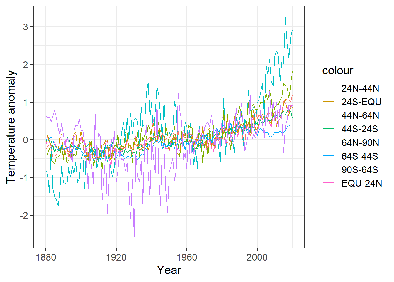
This is a big mess. It would be hard to clean up the appearance, and would require a lot of retyping if we decided to group the data into different bands of latitude.
We can do this much more easily with the pivot_longer function:
bands = names(giss_zonal) # column names of the tibble
bands = bands[-1] # drop the first column ("year")
labels = c("64N-90N", "44N-64N", "24N-44N", "EQU-24N",
           "24S-EQU", "44S-24S", "64S-44S", "90S-64S")
tidy_zonal = giss_zonal %>%
  pivot_longer(cols = -year, names_to = "latitude", values_to = "anomaly")
Let’s see what the result of this looks like:
head(tidy_zonal)## # A tibble: 6 x 3
## year latitude anomaly
## <int> <chr> <dbl>
## 1 1880 x64n_90n -0.81
## 2 1880 x44n_64n -0.42
## 3 1880 x24n_44n -0.26
## 4 1880 equ_24n -0.16
## 5 1880 x24s_equ -0.1
## 6 1880 x44s_24s -0.02Now we can clean up the latitude column a bit to make it more friendly for
human readers:
tidy_zonal = tidy_zonal %>%
  mutate(latitude = ordered(latitude, levels = bands,
                            labels = labels)) %>%
  arrange(year, latitude)

head(tidy_zonal)
## # A tibble: 6 x 3
## year latitude anomaly
## <int> <ord> <dbl>
## 1 1880 64N-90N -0.81
## 2 1880 44N-64N -0.42
## 3 1880 24N-44N -0.26
## 4 1880 EQU-24N -0.16
## 5 1880 24S-EQU -0.1
## 6 1880 44S-24S -0.02In this, the mutate command converts the latitude band into an ordered factor
where the order is the order of the original columns.
This gets R to sort them in the order of latitude bands, instead of
alphabetically, when it makes the legend for the plot.
The labels parameter then changes the names from the original column name,
which was somewhat cryptic, to something a person can make sense of.
Now let’s plot it:
ggplot(tidy_zonal, aes(x = year, y = anomaly, color = latitude)) +
  geom_line() +
  labs(x = "Year", y = "Temperature anomaly")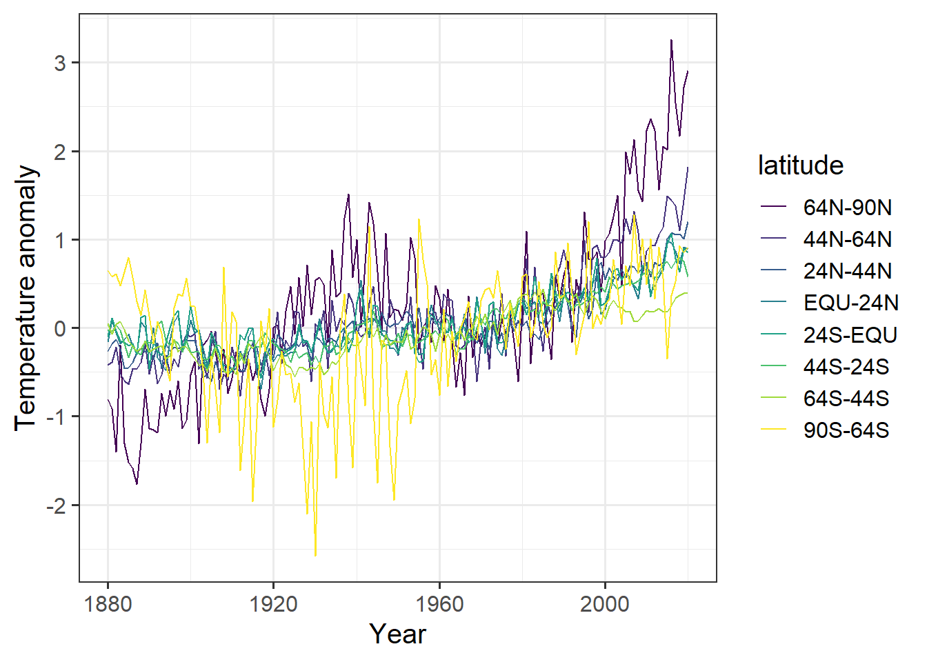
The code for making the plot was a lot simpler, and by using an ordered factor, we could control the order of the latitude bands in the legend, which now appear in a sensible order. It is much easier to look at this graph and quickly recognize that the far northern latitudes (64N–90N, and to a lesser extent 44N–64N) are warming up much faster than the rest of the planet.
Back in 1967, one of the first global climate models predicted that global warming due to greenhouse gases would cause the far northern latitudes to warm up much faster than the rest of the planet. This data confirms that prediction.
We also see that the Southern Hemisphere has warmed much less than the Northern. Think about why that might be.
The pivot_wider function is the inverse of pivot_longer.
It pivots a tibble by spreading one column of data into many columns,
using a second column to indicate the names of those columns.
For each row, the data in the “value” column is moved to a new column named by
the “key” column.
Let’s go back to the weather_summary tibble we made above:
head(weather_summary)## # A tibble: 6 x 5
## year location prcp_max prcp_tot t_range.max
## <dbl> <chr> <int> <int> <int>
## 1 1950 Chicago IL 630 10105 244
## 2 1950 Nashville, TN 846 16330 244
## 3 1951 Chicago IL 721 10970 233
## 4 1951 Nashville, TN 973 14838 233
## 5 1952 Chicago IL 406 7188 217
## 6 1952 Nashville, TN 1176 10113 239Let’s set it up to make it easy to compare the annual precipitation of Nashville and Chicago:
x = weather_summary %>% select(year, location, prcp_tot) %>%
  pivot_wider(names_from = "location", values_from = "prcp_tot")
tail(x)
## # A tibble: 6 x 3
## year `Chicago IL` `Nashville, TN`
## <dbl> <int> <int>
## 1 2015 11688 12907
## 2 2016 10667 10861
## 3 2017 11599 13446
## 4 2018 11203 14976
## 5 2019 13698 16329
## 6 2020 NA 13323Graphing Data
Here, we will look at the ggplot2 package for plotting data. This
package is automatically loaded when you load the tidyverse collection
with library(tidyverse). It follows a theory of making useful graphs
of data called, “The Grammar of Graphics” (that’s where the “gg” comes from).
The idea is that a graph has several distinct parts, which come together:
- One or more layers of graphics. A layer consists of the following:
- A data table with one or more columns, each corresponding to a different variable,
- A mapping of different variables (columns) in the data table to different,
aesthetics of the plot. Aesthetics are things like
- the x coordinate,
- the y coordinate,
- the color of the point or line,
- the fill color that is used to fill in areas, like the interior of a rectangle or circle.
- the shape of points (e.g., circle, square, triangle, cross, diamond, …)
- the size of points and lines
- the linetype (e.g., solid, dashed, dotted, …)
- and so forth …
- A geometry (point, line, box, etc.) that is used to draw the data
- A coordinate system (axes and legends)
There are some more aspects to the gramar of graphics, but we don’t need them for what we’re going to do.
These graphics functions are explained in detail in Chapter 3 of R for Data Science.
A simple graph has just one layer:
ggplot(data = tidy_zonal, # the data
       # the mapping of variables to aesthetics
       mapping = aes(x = year, y = anomaly, color = latitude, shape = latitude)
       ) +
  geom_point() + # the geometry
  labs(x = "Year", y = "Temperature Anomaly") # labels for the coordinates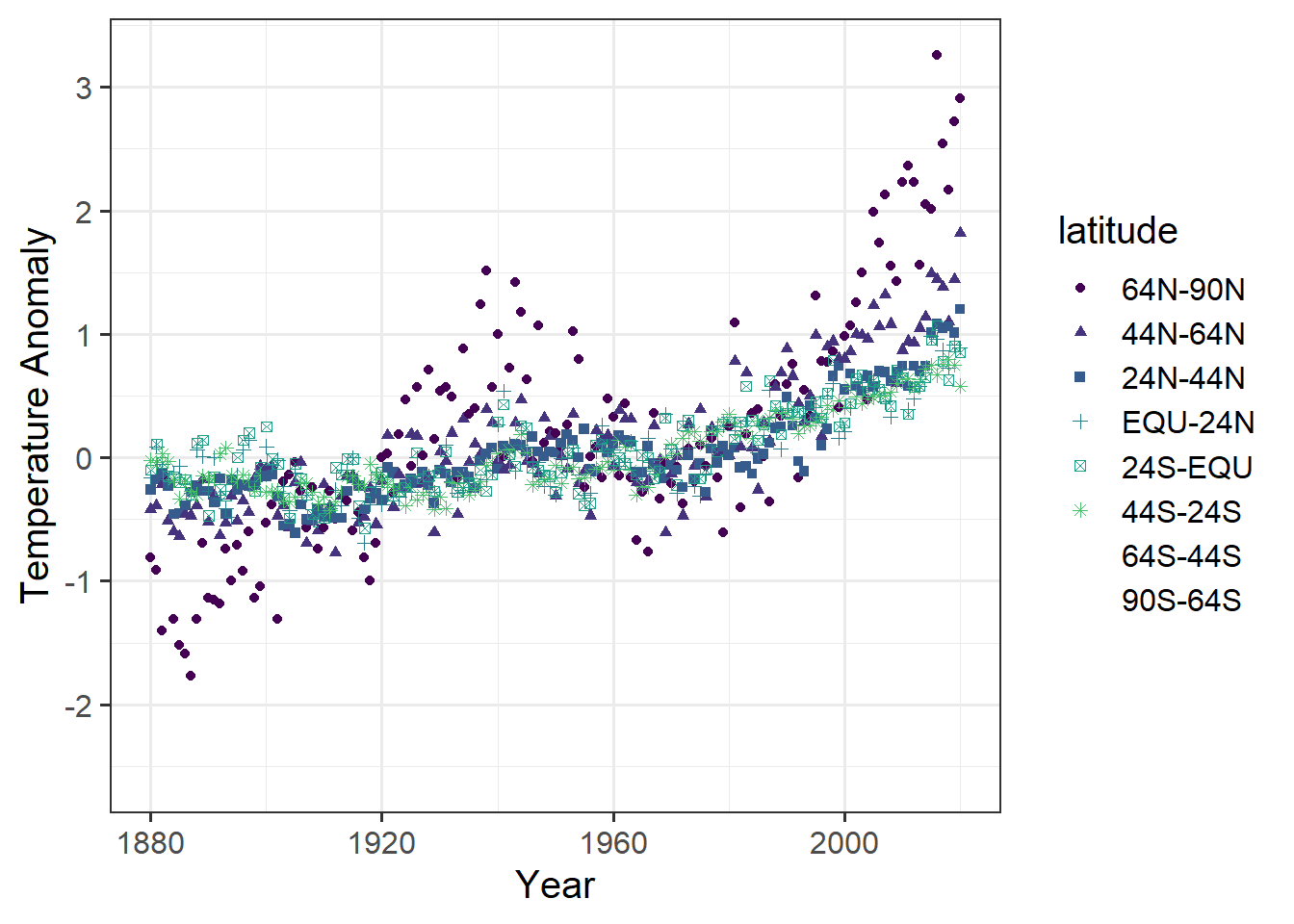
We can also make a plot with the same data, but two layers:
ggplot(data = tidy_zonal, # the data
       # the mapping of variables to aesthetics
       mapping = aes(x = year, y = anomaly, color = latitude, shape = latitude)
       ) +
  geom_point() + # the geometry of the first layer
  geom_line() +  # the geometry of the second layer
  labs(x = "Year", y = "Temperature Anomaly") # labels for the coordinates
We can also use different mappings for different layers
annual_extremes = weather %>% mutate(year = year(date)) %>%
  group_by(location, year) %>%
  summarize(tmin = min(tmin, na.rm = T),      # the na.rm = T means to ignore
            tmax = max(tmax, na.rm = T)) %>%  # missing values if we don't put
  ungroup()                                   # that in, then  if any year has
                                              # a missing value for even one
                                              # day, the tmax or tmin for that
                                              # year will be recorded as
                                              # NA (missing)

ggplot(annual_extremes,                       # The data
       aes(x = year, color = location) ) +    # Shared aesthetics go here
                                              #
  geom_point(aes(y = tmin, shape = "min")) +  # Aesthetics that are different
  geom_point(aes(y = tmax, shape = "max")) +  # for different geometrries go
                                              # with the geometry.
                                              #
  xlim(1990,2000) +                           # Set the range of the x-axis,
                                              # part of the coordinate
                                              # specification
                                              #
  labs(x = "Year", y = "Temperature Anomaly") # labels for the coordinates
Note that ggplot issued several harmless warnings to tell us that
setting the limits of the x-axis the way we did cause some points not to be
plotted.
We can tell RMarkdown not to include those warnings in the document by adding
“warning=FALSE” to the options for the chunk
If we want to specify aesthetics as having fixed values, we can specify them outside of the mapping. Here I specify the size and color of lines:
ggplot(data = annual_extremes) +
  geom_line(aes(x = year, y = tmin, group = location),
            color = "dark blue", size = 1) +
  geom_line(aes(x = year, y = tmax, group = location),
            color = "dark red", size = 0.3) +
  geom_point(aes(x = year, y = tmin, color = location, shape = "min"),
             size = 2) +
  geom_point(aes(x = year, y = tmax, color = location, shape = "max"),
             size = 2) +
  xlim(1990,2000) + # set the range of the x-axis,
                    # part of the coordinate specification
  labs(x = "Year", y = "Temperature Anomaly") # labels for the coordinates
We can also take finer control of the axis formatting:
ggplot(data = annual_extremes) +
  geom_line(aes(x = year, y = tmin, group = location),
            color = "dark blue", size = 1) +
  geom_line(aes(x = year, y = tmax, group = location),
            color = "dark red", size = 0.3) +
  geom_point(aes(x = year, y = tmin, color = location, shape = "min"),
             size = 2) +
  geom_point(aes(x = year, y = tmax, color = location, shape = "max"),
             size = 2) +
  scale_x_continuous(limits=c(1990,2000),
                     breaks = c(1990, 1992, 1994, 1996, 1998, 2000)) +
  # ^^^ the "breaks" parameter for an axis tells R where to put the labels
  labs(x = "Year", y = "Temperature Anomaly") # labels for the coordinates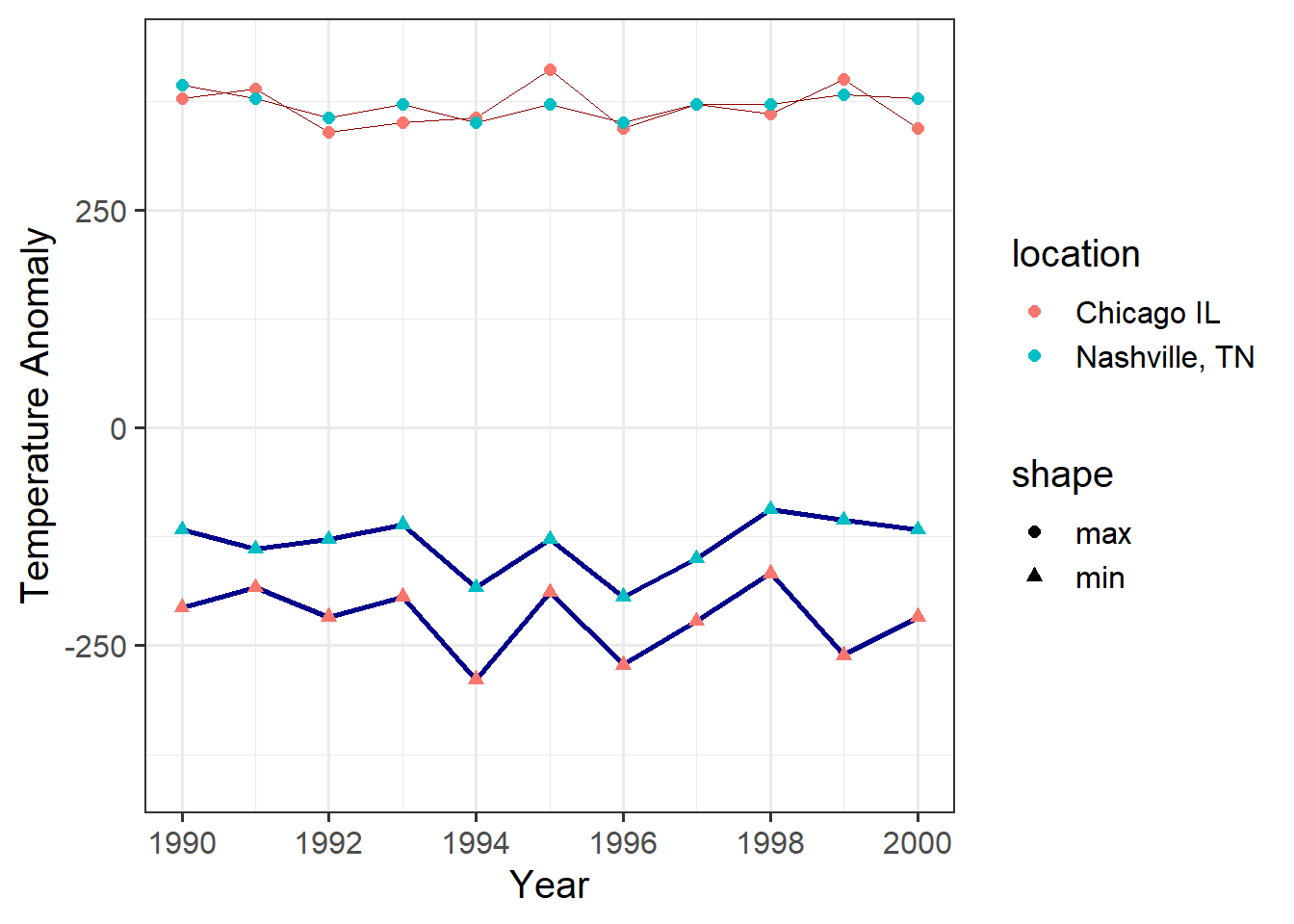
And, of course, we could use pivot_longer to simplify this graph:
annual_extremes_tidy = annual_extremes %>%
  pivot_longer(cols = -c(year, location), names_to = "Temperature",
               values_to = "value")

ggplot(data = annual_extremes_tidy,                   # the data
       aes(x = year, y = value, color = location)) +  # the aesthetics
  geom_line(aes(size = Temperature)) +                # for lines, the size
                                                      # varies with Temperature
  geom_point(aes(shape = Temperature), size = 2) +    # for points, the shape
                                                      # varies with Temperature
  scale_size_manual(values = c(tmax = 0.5,
                               tmin = 0.1)) + # set coordinates for "size"
  scale_x_continuous(limits=c(1990,2000),
                     breaks = c(1990, 1992, 1994, 1996, 1998, 2000)) +
  # ^^^ Set coordinates for the x-axis.
  scale_color_brewer(palette = "Set1", name = "City") +
  # We can override the default color palette.
  # The Brewer palettes are very good for people with color-blindness.
  labs(x = "Year", y = "Temperature Anomaly") # labels for the coordinates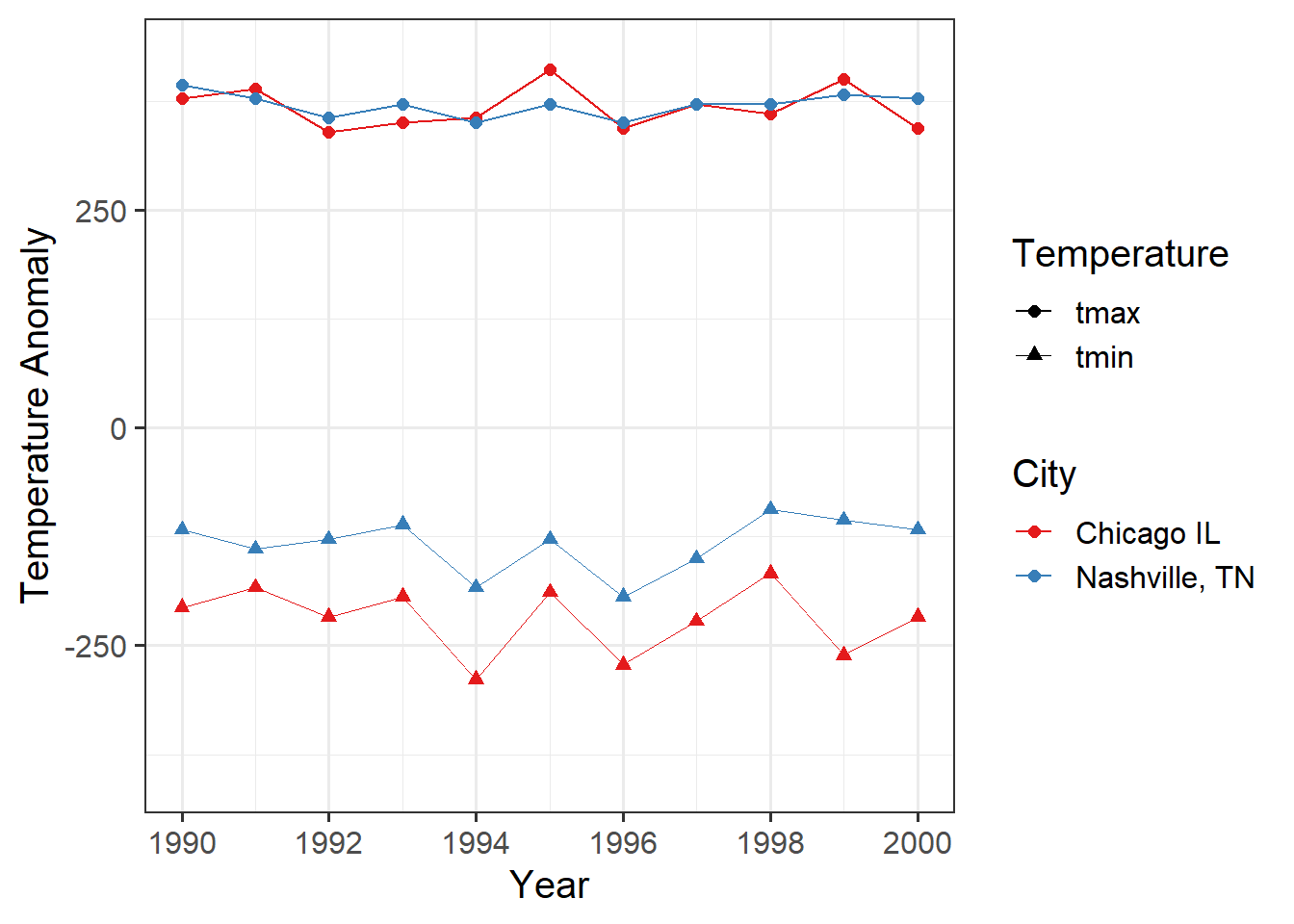
This is one difference between a
data.frameand atibble:tibbles show the data type of each column when you print them, butdata.frames don’t.↩︎
