Lab #6 Lab #6 Answers
PDF version
Lab #6 Answers
Exercise 1: Weathering as a Function of CO2
In this exercise, I studied how weathering changes when the amount of CO2 in the atmosphere changes, and how this helps the silicate weathering cycle work as a thermostat that controls the earth’s temperature.
To study changes in weathering, I simulated what would happen if the amount of volcanic activity around the world suddenly increased, which would mean an increase in the amount of volcanic degassing that releases CO2 into the atmosphere.
The GEOCARB model makes it very easy to simulate a sudden change in degassing: In class we looked at GEOCARB with an emphasis on what happens after a “spike” of CO2 is suddenly released all at once at year zero. For this experiment I was more interested in what happens when there is a sustained increase in CO2 released to the atmosphere, so I ran GEOCARB with the CO2 spike set to zero and volcanic degassing that increased from 7.5 during the spinup phase to 10.0 during the simulation phase.
geocarb_data = run_geocarb(co2_spike = 0, degas_spinup = 7.5, degas_sim = 10.0)With a spike of CO2, there was a sudden release at year zero and atmospheric
CO2 shot up and then gradually came back down to its former value.
That happened because there was no sustained source of extra CO2.
But here, when the degassing rate goes up, there is a constant source of extra
CO2 so we see something different:
ggplot(geocarb_data, aes(x = year, y = co2_atmos)) + geom_line(size = 1) +
  scale_x_continuous(labels = label_comma()) +
  labs(x = "Year", y = "Atmospheric CO2 (ppm)")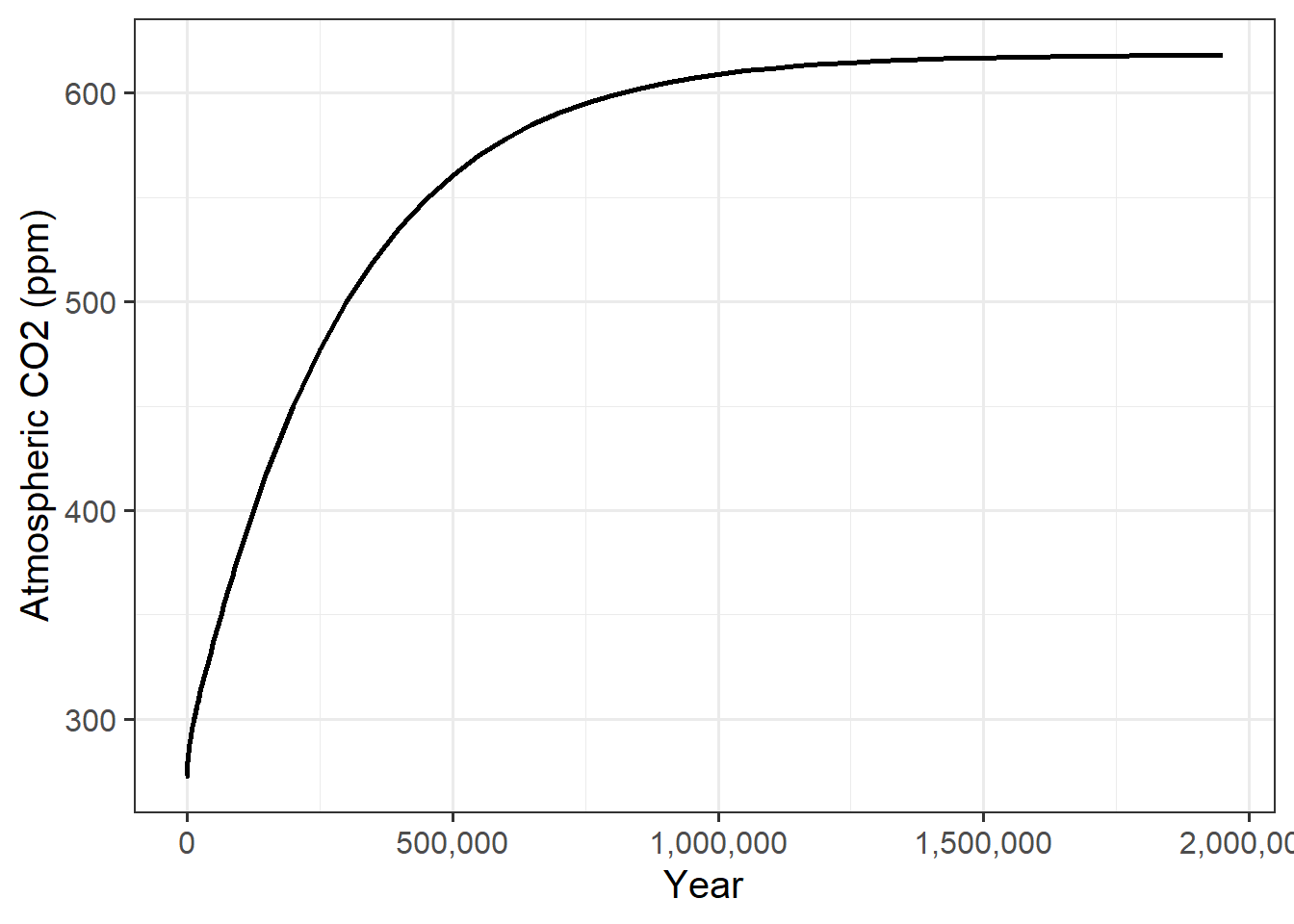
Figure 1: The rise and eventual stabilization of carbon dioxide in the atmophere after a sudden and sustained increase in the rate of volcanic degassing.
As CO2 rises, I expected temperature to rise as well, and that is indeed what I saw.
ggplot(geocarb_data, aes(x = year, y = temp_atmos)) + geom_line(size = 1) +
  scale_x_continuous(labels = label_comma()) +
  labs(x = "Year", y = "Atmospheric Temperature (K)")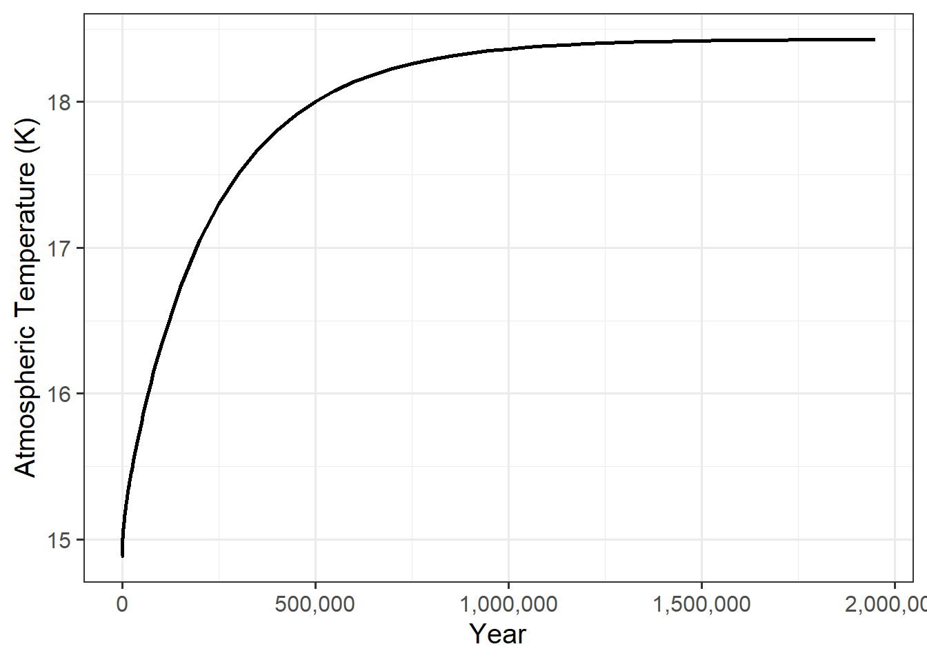
Figure 2: Change in the atmospheric temperature after a sudden and sustained increase in the rate of volcanic degassing of CO2.
What we see is that when the degassing rate changed, both the the CO2 concentration and the temperature rise quickly, but as they got closer to their new equilibrium values, the rate of change slowed down, so that after about 1 million years, the CO2 concentration and temperature were both slowly approaching their ultimate stable values.
Stabilization of CO2
My first research question was to find out how long it takes CO2 to stabilize after the degassing rate changes, and what the new stable value is.
The CO2 concentration never actually gets to a stable value where it stops changing, but over time the rate of change slows down as it gets closer and closer to the stable value.
This means that we need to define what it means for CO2 to stabilize. For the purposes of this lab, I will follow the lab instructions and define the time when CO2 stabilizes as the time when the rate of change becomes smaller than some threshold. In this case, I followed the lab instructions and defined this threshold as a rate of change of 1 part per million in 50,000 years.
I can calculate the rate of change with the R expression
(co2_atmos - lag(co2_atmos)) / (year - lag(year)).
I have to include the denominator (year - lag(year)) because if you look at
the data returned from the GEOCARB model, the number of years per time step
changes. Right after year 0, the time step between consecutive rows of the
data is 50 years. At 1,500 years, the time step increases to 500 years per row;
at 30,000 years, it increases to 5,000 years per row;
and at 150,000 years, it increases to 50,000 years per row.
One additional complication is that in this case, the CO2 level is rising, but if I were looking at a case where CO2 was falling, the rate of change would be negative, so even when CO2 was changing rapidly (e.g., -200 ppm per 50,000 years) the rate of change would be less than 1 ppm per 50,000 years. For this reason, I will define stabilization as occurring when the absolute value of the rate of change is less than 1 ppm per 50,000 years.
Taking this working definition of stabilization,I find the year when the CO2 concentration stabilizes by filtering the model output to keep only the rows that meet two conditions:
- The year is greater than zero (so it’s after the degassing rate went up) and
- where the absolute value of the rate of change in atmospheric CO2 is less than 1 / 50000.
The first row of this new data table will be the year when CO2 stabilized, according to our definition:
stabilized = geocarb_data %>%
  mutate(rate_co2 = (co2_atmos - lag(co2_atmos)) / (year - lag(year))) %>%
  filter(year > 0, abs(rate_co2) < 2E-5)
stabilization_year = stabilized$year[1]
stabilized_co2 = tail(stabilized, 1)$co2_atmos
# Remember that 5E4 is how we tell R 5 times 10^4, which is 50,000
After the degassing rate changes, it takes 1.2× 10⁶ years for the
atmosphere to stabilize.
Even at 2 million years, CO2 is changing slightly, so I estimated the new
stable value of CO2 as the value in the last line in the tibble, which
is rround(stabilized_co2, 0)` parts per million, rather than the
concentration in the year when it stabilized.
Dynamics of Weathering
Next, I looked at what happened to weathering after the degassing rate increased.
geocarb_data %>% select(year, degassing_rate, silicate_weathering) %>%
   rename(weathering = "silicate_weathering", degassing = "degassing_rate") %>%
  pivot_longer(cols = -year, names_to = "variable", values_to = "value") %>%
  ggplot(aes(x = year, y = value, color = variable)) +
  geom_line(size = 1) +
  scale_x_continuous(labels = label_comma()) +
  scale_color_brewer(palette = "Dark2", name = "Rate") +
  labs(x = "Year", y = "Rate (trillion moles/year)")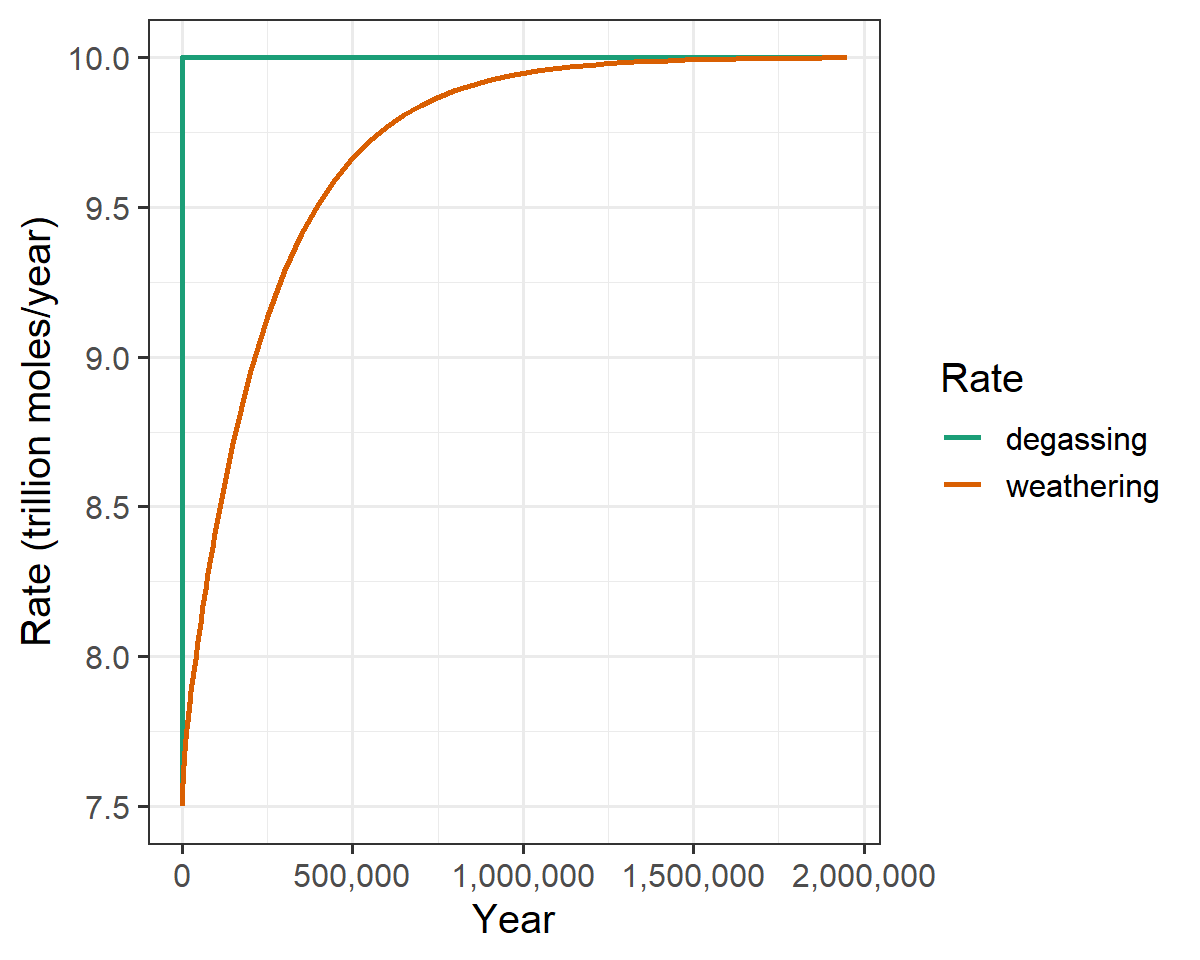
Figure 3: Change in the silicate weathering rate after a sudden change in the rate of volcanic degassing of CO2.
The Silicate Weathering Thermostat
It can be useful to see how the temperature affects the rate of weathering:
ggplot(geocarb_data, aes(x = temp_atmos, y = silicate_weathering)) +
   geom_line(size = 1) +
   labs(x = "Atmospheric Temperature (K)", y = "Silicate weathering (trillion moles/year)")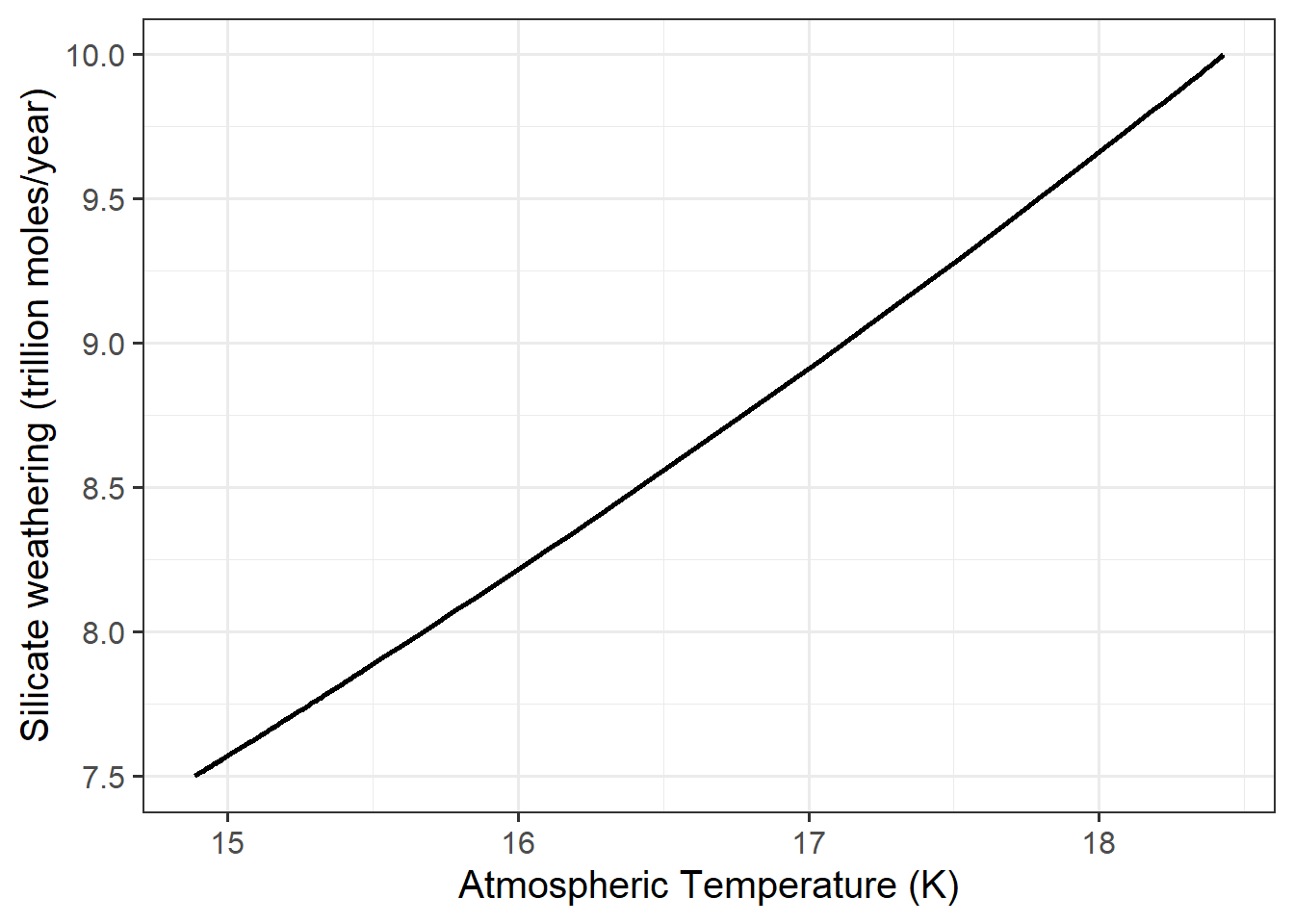
There is a clear relationship between temperature and weathering.
It is clear from looking at the figures above that after the degassing rate increased:
- The imbalance between degassing and weathering caused the amount of CO2 to rise.
- The rising CO2 caused the temeperature to rise.
- And the rising temperature caused weathering to rise.
In the steady state, the rate of weathering must balance the rate of CO2 degassing from the Earth, from volcanoes and deep-sea vents, and indeed, as the rate of change of CO2 in the atmosphere stabilizes, the weathering rate is very close to the degassing rate.
The following plot is not required for the lab, but it can be interesting to plot the rate of change in CO2 concentration versus the difference between degassing and weathering:
geocarb_data %>%
   mutate(rate_co2 = (co2_atmos - lag(co2_atmos)) / (year - lag(year)),
          diff = degassing_rate - silicate_weathering) %>%
   ggplot(aes(x = diff, y = rate_co2)) +
   geom_line(size = 1) +
   labs(x = "Degassing - weathering", y = "Rate of change of CO2")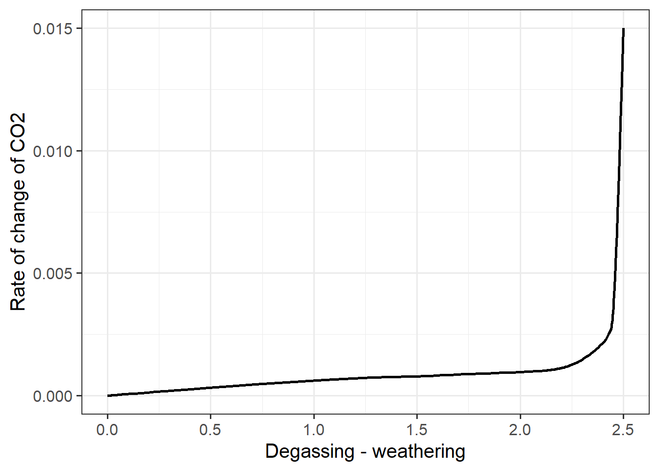
Figure 4: The rate of change in atmospheric CO2 versus the difference between the degassing rate and the weathering rate
In this graph, we can really see the thermostat in action: When there is a big difference between degassing and weathering, the CO2 concentration in the atmosphere rises, which causes the temperature to rise, which increases the rate of weathering. As the rate of weathering gets closer to the rate of degassing, the difference $( - ) gets closer to zero, and the rate of change of CO2 becomes smaller. Eventually, the atmosphere stabilizes when degassing becomes very close to weathering, so the difference is very close to zero, and the rate of change of CO2 becomes so close to zero that for all practical purposes, the amount of CO2 in the atmosphere stops changing.
That is how the silicate weathering thermostat works.
The effect of changing degassing rates
Finally, I explored how the final, stable CO2 concentration and atmospheric temperature depend on the degassing rate. Here, I am only interested in the final quasi-stabilized value of CO2 and atmospheric temperature for each value of degassing, so I can see how the stable conditions depend on the degassing rate.
multi_degas_data = tibble()
for (degas_rate in c(7.5, 10, 12.5, 15, 17.5, 20)) {
   geocarb_data = run_geocarb(co2_spike = 0, degas_spinup = 7.5,
                              degas_sim = degas_rate)
   last_row = tail(geocarb_data, 1)
   multi_degas_data = bind_rows(multi_degas_data, last_row)
}
Now I can plot the stable value of CO2 versus the degassing rate:
ggplot(multi_degas_data, aes(x = degassing_rate, y = co2_atmos)) +
   geom_line(size = 1) +
   labs(x = "Degassing (trillion moles per year)", y = "Stabilized CO2 (ppm)")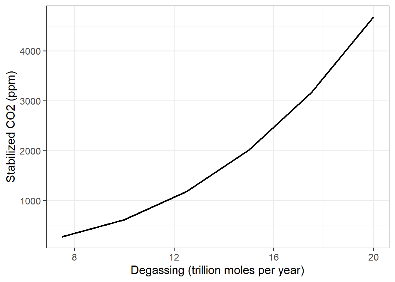
Next, I plot the difference between weathering and degassing at the end of each GEOCARB run:
ggplot(multi_degas_data, aes(x = degassing_rate,
                             y = degassing_rate - silicate_weathering)) +
   geom_line(size = 1) +
   labs(x = "Degassing (trillion moles per year)", y = "Degassing - Weathering")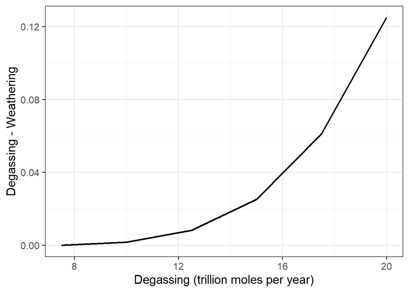
We see here that weathering doesn’t exactly match degassing at the end of 1.95 million years, but it’s very close. The differences are less than 1% of the degassing rate (e.g., a difference of 0.04 when degassing is 16, which works out to 0.25% of the degassing rate)
Next, I plot the stabilized silicate weathering rate versus CO2 concentration
ggplot(multi_degas_data, aes(x = co2_atmos, y = silicate_weathering)) +
   geom_line(size = 1) +
   labs(x = "Stabilized CO2 (ppm)", y = "Silicate weathering (trillion moles/year)")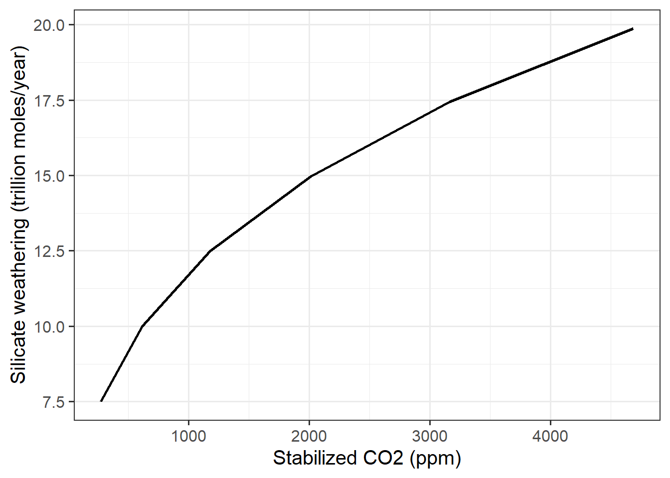
So we see that silicate weathering rises as CO2 does. The mechanism for this is largely the rise in temperature, which we can also plot:
ggplot(multi_degas_data, aes(x = temp_atmos, y = silicate_weathering)) +
   geom_line(size = 1) +
   labs(x = "Atmospheric temperature (K)", y = "Silicate weathering (trillion moles/year)")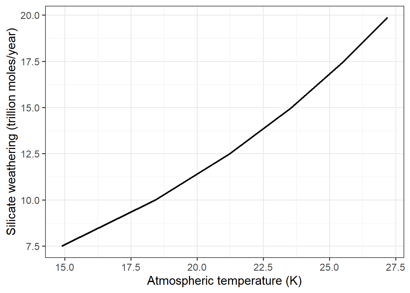
We see that rising temperature strongly affects weathering. This is how the silicate weathering thermostat works.
Exercise 2: The Long-Term Fate of Fossil Fuel CO2
In the previous exercise, I looked at how the earth responds to a sustained increase in CO2 emissions over millions of years. Here, I will look at what happens when there is a one-time release of a very large quantity of CO2. From a geological perspective, where people think in terms of millions of years, this is a good approximation of the release of fossil fuels. In the end, we expect that people will have burned a lot of fossil fuels in the span of 200 years or so and then will stop.
Here I am going to investigate what happens after we stop burrning fossil fuels.
I start with a very simple experiment: What would have happened to the atmosphere if people didn’t burn any fossil fuels. To simulate this, I set the CO2 spike to 0 and also set the volcanic degassing rate during the simulation to the same value I used in the spinup (7.5 trillion moles per year).
geocarb_null = run_geocarb(co2_spike = 0, degas_spinup = 7.5, degas_sim = 7.5)Now, I plot the change in CO2, silicate weathering, carbonate weathering, and total weathering, when the transition occurs at year 0:
geocarb_null %>% filter(year >= -200, year <= 200) %>%
   select(year, co2_atmos, silicate_weathering, carbonate_weathering,
          total_weathering) %>%
   kable(digits = 2,
         col.names = c("Year", "CO~2~", "Silicate Weathering",
"Carbonate Weathering", "Total Weathering"))| Year | CO2 | Silicate Weathering | Carbonate Weathering | Total Weathering |
|---|---|---|---|---|
| -200 | 272.64 | 7.5 | 8.39 | 15.89 |
| -150 | 272.64 | 7.5 | 8.39 | 15.89 |
| -100 | 272.64 | 7.5 | 8.39 | 15.89 |
| -50 | 272.64 | 7.5 | 8.39 | 15.89 |
| 0 | 272.64 | 7.5 | 8.39 | 15.89 |
| 50 | 272.64 | 7.5 | 8.39 | 15.89 |
| 100 | 272.64 | 7.5 | 8.39 | 15.89 |
| 150 | 272.64 | 7.5 | 8.39 | 15.89 |
| 200 | 272.64 | 7.5 | 8.39 | 15.89 |
This is completely unsurprising: If we don’t put any extra CO2 in the atmosphere, the amount of CO2 in the atmosphere does not change.
Now I start looking at what happens when we do put CO2 in the atmosphere. I ran GEOCARB with a spike of 2000 billion tons of CO2 released into the atmosphere at year 0. Near year 0, each time step in the simulation represents 50 years, so this is a slight simplification, but from the perspective of thousands or millions of years, it is pretty close to what we see happening in the real world.
geocarb_2k_spike = run_geocarb(co2_spike = 2000, degas_spinup = 7.5,
                               degas_sim = 7.5)
Now I am going to plot what happens to the silicate weathering right after the spike (i.e., right after year 0), and then I will plot the three kinds of weathering before and after year zero, when the spike is released.
In the code below, I use the str_replace_all function to change
silicate_weathering to silicate and so forth. I also use the ordered
function to arrange the order in which silicate, carbonate, and total
appear in the legend, from top to bottom, to match the order the three lines
appear in the graph. That’s a level of fussiness I don’t expect from students’
lab reports, but I put it in so you can see how it’s done.
weathering_history = geocarb_2k_spike %>%
   select(year, silicate_weathering, carbonate_weathering, total_weathering) %>%
   pivot_longer(cols = -year, names_to = "Weathering", values_to = "rate") %>%
   mutate(Weathering = str_replace_all(Weathering, "_weathering", "") %>%
             ordered(levels = c("total", "silicate", "carbonate")))

ggplot(weathering_history, aes(x = year, y = rate, color = Weathering)) +
   geom_line(size = 1, na.rm = TRUE) +
   scale_color_brewer(palette = "Dark2") +
   xlim(-500, 1000) +
   labs(x = "Year", y = "Rate (trillion moles per year)")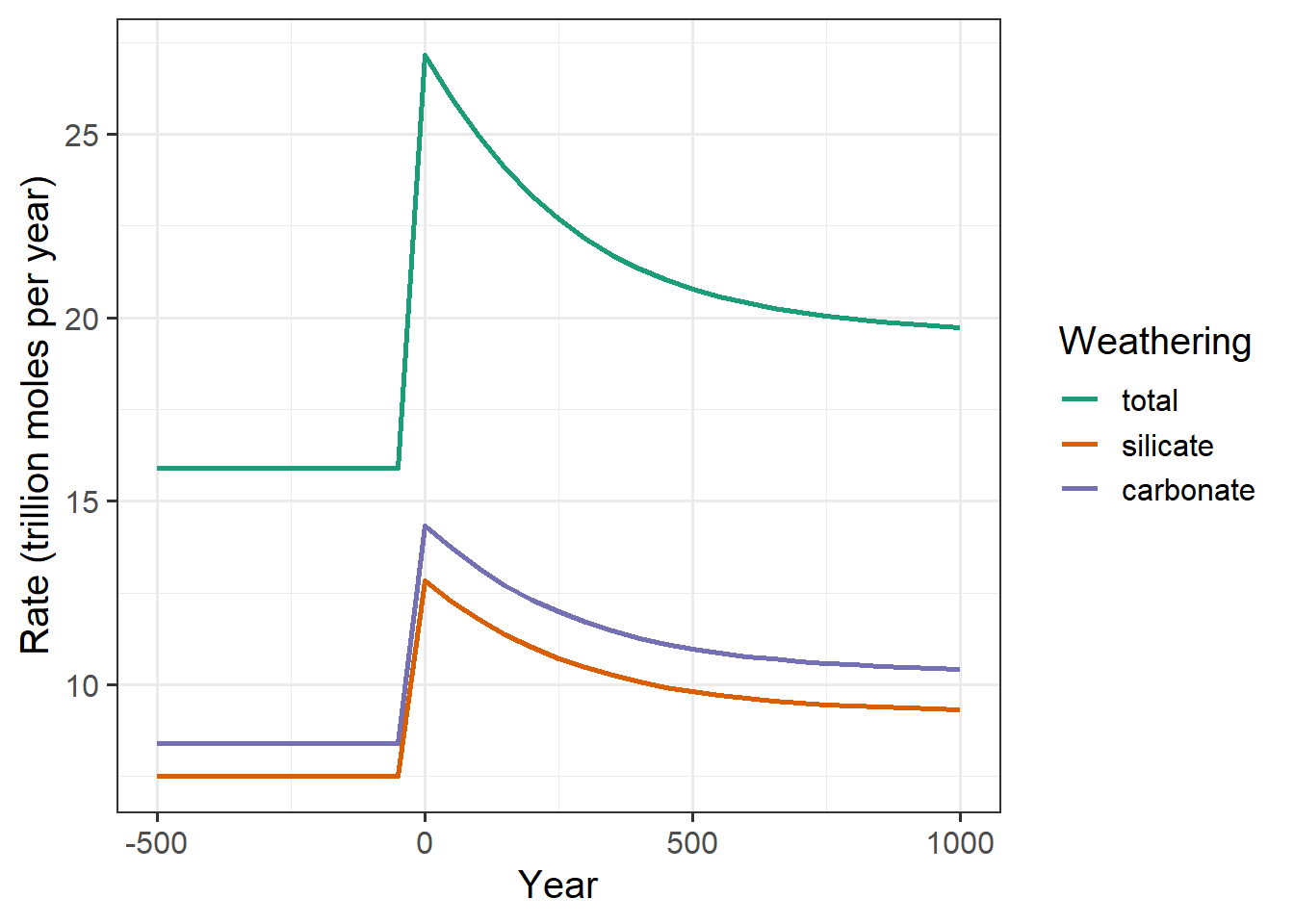
(#fig:plot_co2_spike-fast)Silicate weathering right after a spike of CO2 containing 2000 BT carbon is released
Next, I look over a much longer time:
ggplot(weathering_history, aes(x = year, y = rate, color = Weathering)) +
   geom_line(size = 1, na.rm = TRUE) +
   scale_color_brewer(palette = "Dark2") +
   labs(x = "Year", y = "Rate (trillion moles/year)")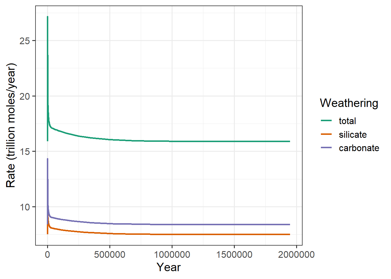
(#fig:plot_co2_spike-slow)Silicate weathering right after a spike of CO2 containing 2000 BT carbon is released
To test when the CO2 stops changing, I use the same criterion I did in the previous exercise: when the absolute value of the rate of change is less than 1 ppm per 50,000 years. The rate of change of CO2 here is negative (CO2 shoots up right after the spike, and then drops over time until it returns to close to its original value). I define stabilization as when the rate of change is very close to zero, whether it’s positive or negative, so my criterion is for the absolute value of the rate of change to be less than 1 ppm per 50,000 years.
The stabilization year is the first year, after year zero, where this is true. However, because CO2 continues to change slowly even after the nominal stabilization, I estimate the stable value of CO2 to be the value at the very end of the run, at 1.95 million years.
spike_stabilized = geocarb_2k_spike %>%
   mutate(co2_rate = (co2_atmos - lag(co2_atmos)) / (year - lag(year))) %>%
   filter(year > 0, abs(co2_rate) < 2E-5)
stabilization_year = head(spike_stabilized$year, 1)
stabilization_value = tail(spike_stabilized$co2_atmos, 1)CO2 approximately stabilizes after 700,000 years, and the final stable value is approximately 272.7 ppm.
Weathering and carbonate burial
Next, I looked at how the relationship between total weathering and carbonate burial changed over time. Total weathering measures the rate at which new carbonate that is released into the oceans, and carbonate burial is the rate at which carbonate is removed from the oceans by being converted to solid minerals and buried on the sea floor.
carbonate_history = geocarb_2k_spike %>%
   select(year, "Carbon burial" = carbon_burial,
          "Total weathering" = total_weathering) %>%
   pivot_longer(cols = -year, names_to = "variable", values_to = "value")
ggplot(carbonate_history, aes(x = year, y = value, color = variable)) +
   geom_line(size = 1, na.rm = TRUE) +
   scale_color_brewer(palette = "Dark2", name = NULL) +
   xlim(-1E3, 1E4) +
   labs(x = "Year", y = "Rate (trillion moles per year)")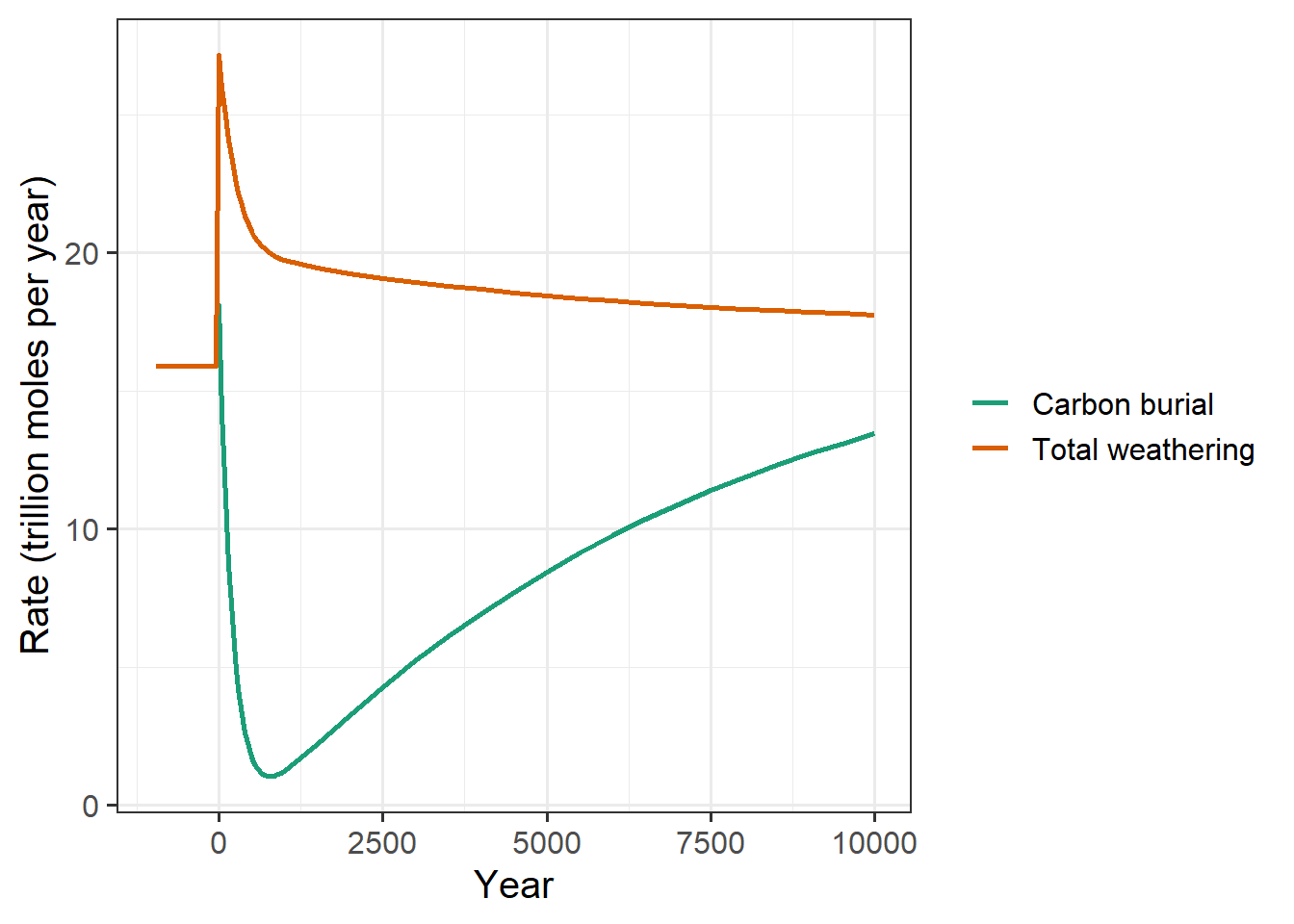
When CO2 dissolves into the oceans from the atmosphere, it depletes carbonate in the oceans. This slows down the rate of carbonate burial. Meanwhile, as CO2 builds up in the atmosphere, the temperature rises and the weathering rate goes up.
Weathering adds more carbonate to the ocean, which replaces the carbonate that was converted to bicarbonate by reacting with CO2 from the atmosphere. As the carbonate in the oceans starts to rise, the carbonate burial also rises.
Eventually, as the amount of CO2 in the atmosphere stabilizes, the total weathering rate and the carbonate burial rate should become roughly equal.
Now, let’s look at the rates over a longer period of time:
ggplot(carbonate_history, aes(x = year, y = value, color = variable)) +
   geom_line(size = 1, na.rm = TRUE) +
   scale_color_brewer(palette = "Dark2", name = NULL) +
   xlim(NA, 3E5) +
   labs(x = "Year", y = "Rate (trillion moles per year)")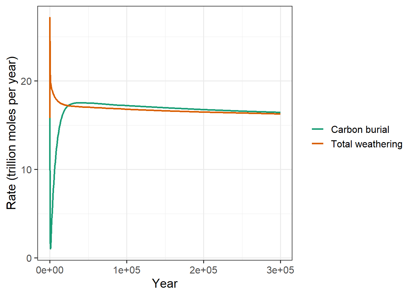
After a few hundred thousand years, the difference between the two rates is too small to see on a graph that shows the initial spike, so I plotted the rates of burial and weathering starting 1 million years after the spike:
carbonate_history %>% filter(year >= 1E6) %>%
ggplot(aes(x = year, y = value, color = variable)) +
   geom_line(size = 1, na.rm = TRUE) +
   scale_color_brewer(palette = "Dark2", name = NULL) +
   xlim(1E6, 2E6) +
   labs(x = "Year", y = "Rate (trillion moles per year)")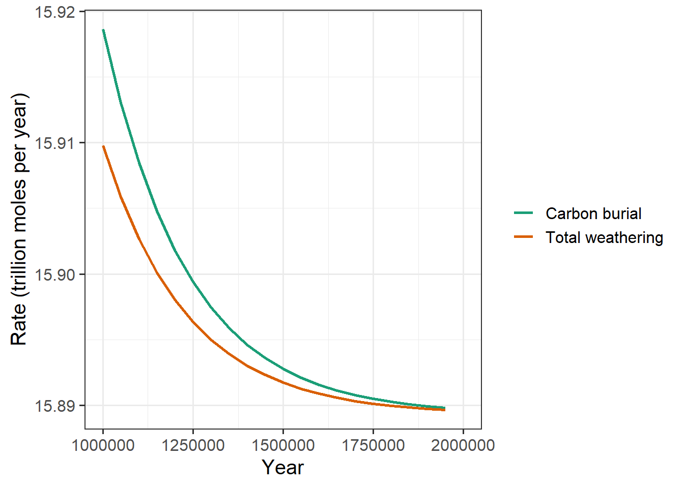
Notice the scale on the vertical axis: The difference between the weathering rate and the burial rate is less than 0.01 trillion moles per year. This is a huge difference from 10,000 years after the spike, when the difference was about 5 trillion moles per year, a factor of 500 greater.
Summary
In this exercise, I explored different aspects of how the geochemical carbon cycle changes after a large amount of CO2 is discharged into the air. What I found was that silicate and carbonate weathering do eventually remove the excess CO2 from the atmosphere and that things stabilize when the carbonate burial balances the total weathering.
One important thing this exercise revealed is that the fate of CO2 is ultimately controlled by the rate of geological weathering—the rate at which rain falling on rocks wears them away. This is very slow, and that means that even after we stop burning fossil fuels, it can take hundreds of thousands of years for CO2 to return to its natural concentration in the atmosphere.
Exercise 3 (Graduate Students Only): How the Land Plants Changed the Carbon Cycle
In this exercise, I explored how the emergence of land plants altered the carbon cycle. To do this, I ran the GEOCARB model with no plants during its spinup and then added plants for the simulation, so this simulates a condition where there were no plants for millions of years, and then all of a sudden, at year zero, lots of land plants appeared.
geocarb_plants = run_geocarb(co2_spike = 0, plants_spinup = FALSE,
                             plants_sim = TRUE)
When the plants appeared, they immediately accelerated the weathering:
geocarb_plants %>% filter(year <= 1000) %>%
   select(year, carbonate_weathering, silicate_weathering, total_weathering) %>%
   pivot_longer(-year, names_to = "weathering", values_to = "rate") %>%
   mutate(weathering = str_replace_all(weathering, "_weathering", "")) %>%
   ggplot(aes(x = year, y = rate, color = weathering)) +
   geom_line(size = 1) +
   scale_color_brewer(palette = "Dark2") +
   scale_x_continuous(labels = label_comma()) +
   labs(x = "Year", y = "Weathering Rate")
Over time, we see that the weathering rate gradually drops back to its original level.
geocarb_plants %>% filter(year <= 1E6) %>%
   select(year, carbonate_weathering, silicate_weathering, total_weathering) %>%
   pivot_longer(-year, names_to = "weathering", values_to = "rate") %>%
   mutate(weathering = str_replace_all(weathering, "_weathering", "")) %>%
   ggplot(aes(x = year, y = rate, color = weathering)) +
   geom_line(size = 1) +
   scale_color_brewer(palette = "Dark2") +
   scale_x_continuous(labels = label_comma()) +
   labs(x = "Year", y = "Weathering Rate")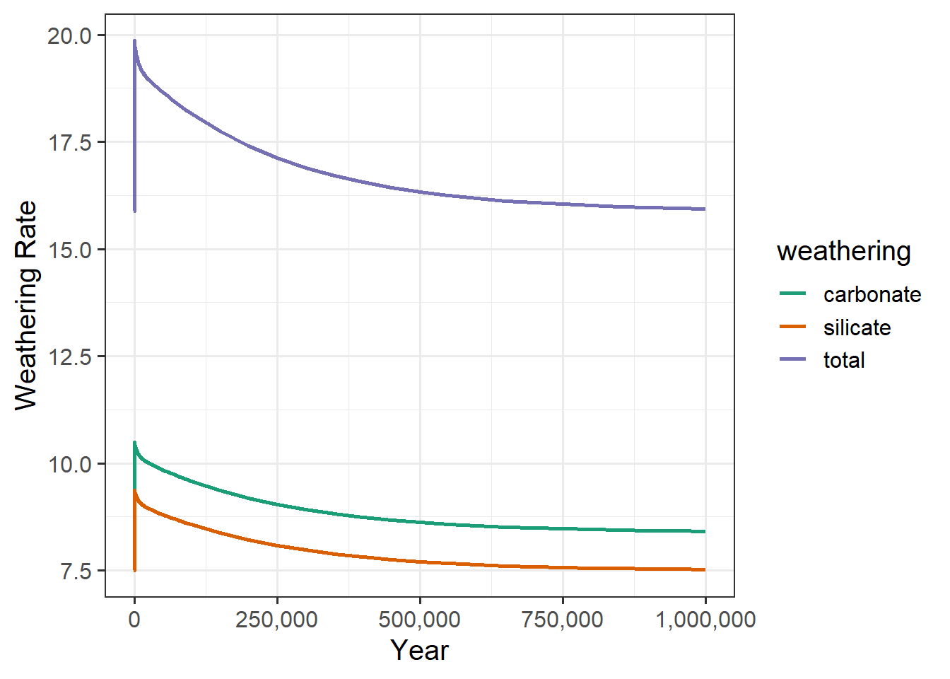
So what does this do to atmospheric CO2 concentrations? When the weathering goes up, our theories tell us that this should remove CO2 from the atmosphere by moving it into the ocean as dissolved carbonate ions, and ultimately converting it to carbonate rocks, so atmospheric CO2 should drop.
geocarb_plants %>%
   ggplot(aes(x = year, y = co2_atmos)) +
   geom_line(size = 1) +
   scale_x_continuous(labels = label_comma()) +
   labs(x = "Year", y = "Atmospheric CO2 (ppm)")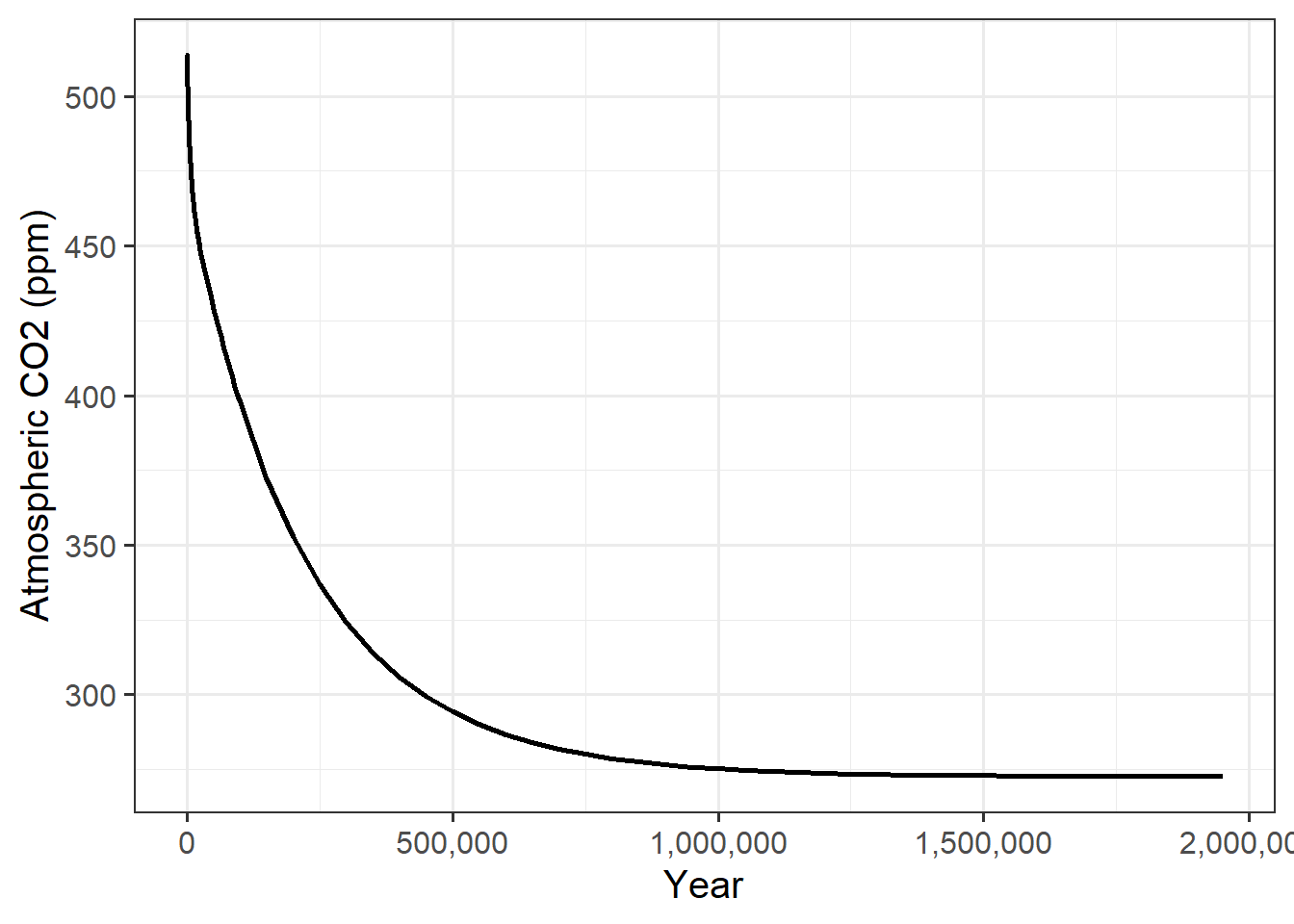
It’s useful to show a detail plot of what happens right at the transition where the plants appear.
geocarb_plants %>% filter(year <= 1000) %>%
   ggplot(aes(x = year, y = co2_atmos)) +
   geom_line(size = 1) +
   scale_x_continuous(labels = label_comma()) +
   labs(x = "Year", y = "Atmospheric CO2 (ppm)")
So the CO2 starts to drop as soon as the plants appear.
