Reading for Lab #2 on Mon., Jan 31:
PDF version
Worked examples for Lab #2: CO2 data
Instructions
This document has worked examples: The first example show how to download measurements of carbon dioxide from the laboratory on Mauna Loa, Hawaii, that was started by C. David Keeling in 1958, analyze the data, and make plots and tables to show the results of your analysis.
After studying the worked example, you will do further analysis and plotting using both the CO2 data from Mauna Loa and also global temperature measurements that you will download from NASA’s Goddard Institute for Space Studies.
The second example shows how to use pivot_longer and pivot_wider
functions to manipulate a data.frame or tibble, and how to use
grouping and summarizing functions.
Worked Example
Downloading CO2 Data from Mauna Loa Observatory
In 1957, Charles David Keeling established a permanent observatory on Mauna Loa, Hawaii to make continuous measurements of atmospheric carbon dioxide. The observatory has been running ever since, and has the longest record of direct measurements of atmospheric carbon dioxide levels. The location was chosen because the winds blow over thousands of miles of open ocean before reaching Mauna Loa, and this means the CO2 measurements are very pure and uncontaminated by any local sources of pollution.
We can download the data from https://scrippsco2.ucsd.edu/assets/data/atmospheric/stations/in_situ_co2/monthly/monthly_in_situ_co2_mlo.csv. We can download the file and save
it to the local computer using the R function download.file
Here, I use the file.exists function so I only download the file if it
doesn’t already exist. That avoids having to download it again if you
already have it.
if (!file.exists('_data/mlo_data.csv')) {
  download.file(mlo_url, '_data/mlo_data.csv')
}
Try opening the data file in Excel or a text editor.
The first 54 lines of the data file are comments describing the data.
These comments describe the contents of each column of data
and explain that this data file uses the special value -99.99 to
indicate a missing value. The Mauna Loa Observatory started recording data
in March 1958, so the monthly averages for January and February are missing.
Other months are missing for some months in the record when the instruments
that monitor CO2 concentrations were not working properly.
The read_csv function from the tidyverse package can read the data into R
and convert it into a data structure that we call a tibble or a
data.frame (it’s kind table of data, similar to the way data is organized in
an Excel spreadsheet).
When R reads in .csv files, it expects column names to be on a
single row,
and lines 55–57 of the data file are column headings that are split across
multiple rows, so R will get confused if we tell it to use those rows as column
names.
To avoid problems, we will tell read_csv to read this data file,
but skip the first 57 lines.
We will also tell it not to look for column names in the data file,
so we will supply the column names, and we will tell it that whenever it sees
-99.99, it should interpret that as indicating a missing value, rather than
a measurement.
Finally, R can guess what kinds of data each column contains, but for this file, things work a bit more smoothly if we provide this information explicitly.
read_csv lets us specify the data type for each column by providing a string
with one letter for each column. The letters are i for integer numbers,
d for real numbers (i.e., numbers with a decimal point and
fractional parts), n for an unspecified number,
c for character (text) data, l for logical (TRUE or FALSE),
D for calendar dates, t for time of day, and T for combined date and time.
mlo_data = read_csv('_data/mlo_data.csv',
                    skip = 57,  # skip the first 57 rows
                    col_names = c('year', 'month', 'date_excel', 'date',
                                  'co2_raw', 'co2_raw_seas',
                                  'co2_fit', 'co2_fit_seas',
                                  'co2_filled', 'co2_filled_seas'),
                    col_types = 'iiiddddddd',
                    # ^^^ the first three columns are integers and the  next
                    # 7 are real numbers
                    na = '-99.99'
                    # ^^^ interpret -99.99 as a missing value
)
Let’s look at the first few rows of the data:
Here is how it looks in R:
head(mlo_data)## # A tibble: 6 x 10
## year month date_excel date co2_raw co2_raw_seas co2_fit co2_fit_seas
## <int> <int> <int> <dbl> <dbl> <dbl> <dbl> <dbl>
## 1 1958 1 21200 1958. NA NA NA NA
## 2 1958 2 21231 1958. NA NA NA NA
## 3 1958 3 21259 1958. 316. 314. 316. 315.
## 4 1958 4 21290 1958. 317. 315. 317. 315.
## 5 1958 5 21320 1958. 318. 315. 318. 315.
## 6 1958 6 21351 1958. NA NA 317. 315.
## # ... with 2 more variables: co2_filled <dbl>, co2_filled_seas <dbl>There are six different columns for the CO2 measurements:
co2_rawis the raw measurement from the instrument. The measurements began in March 1958, so there areNAvalues for January and February. In addition, there are missing values for some months when the instrument was not working well.co2_fitis a smoothed version of the data, which we will not use in this lab.co2_filledis the same asco2_raw, except that where there are missing values in the middle of the data, they have been filled in with interpolated estimates based on measurements before and after the gap.
For each of these three data series, there is also a seasonally adjusted version, which attempts to remove the effects of seasonal variation in order to make it easier to observe the trends.
For this lab, we will focus on the co2_filled data series. To keep things
simple, we can use the select function from tidyverse to keep only certain
columns in the tibble and get rid of the ones we don’t want.
mlo_simple = mlo_data %>% select(year, month, date, co2 = co2_filled)

head(mlo_simple)
## # A tibble: 6 x 4
## year month date co2
## <int> <int> <dbl> <dbl>
## 1 1958 1 1958. NA
## 2 1958 2 1958. NA
## 3 1958 3 1958. 316.
## 4 1958 4 1958. 317.
## 5 1958 5 1958. 318.
## 6 1958 6 1958. 317.Note how we renamed the co2_filled column to just plain co2 in the select
function. There are some missing measurements from months where the laboratory
instruments were not working properly. These are indicated by NA, meaning
“not available.”
We can also use the kable() function from the knitr package to format the
data nicely as a table in an RMarkdown document.
Notice how I can use RMarkdown formatting in the column names and
caption to make the “2” in CO2 appear as a subscript.
head(mlo_simple) %>%
  kable(col.names = c(year = "Year", month = "Month", date = "Date",
                      co2 = "CO~2~ (ppm)"),
caption = "A table of monthly CO~2~ measurements from Mauna Loa.")| Year | Month | Date | CO2 (ppm) |
|---|---|---|---|
| 1958 | 1 | 1958.041 | NA |
| 1958 | 2 | 1958.126 | NA |
| 1958 | 3 | 1958.203 | 315.70 |
| 1958 | 4 | 1958.288 | 317.45 |
| 1958 | 5 | 1958.370 | 317.51 |
| 1958 | 6 | 1958.455 | 317.25 |
Now, let’s plot this data:
ggplot(mlo_simple, aes(x = date, y = co2)) +
  # ^^^ The ggplot command specifies which data to plot and the aesthetics that
  # define which variables to  use for the x and y axes.
  geom_line() +
  # ^^^ The geom_line() command says to plot lines connnecting the data points
  labs(x = "Year", y = "CO2 concentration (ppm)",
       title = "Measured CO2 from Mauna Loa Observatory")
  # ^^^ The labs() command tells ggplot what names to use in labeling the axes
  # and the title for the plot.

  # Earlier in this .Rmd file, I called set_theme(theme_bw(base_size = 15))
  # to set the default plot style. If you call ggplot() without this,
  # you will get a different style, but you can either call theme_set
  # or you can add a theme specification (such as
  # "+ theme_bw(base_size = 15)")
  # to the end of the sequence of plotting commands in order to
  # apply a specific style to an individual plot.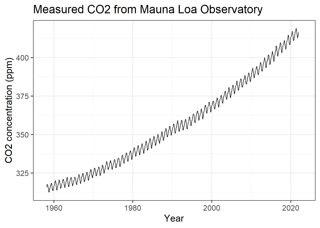
(#fig:plot_mlo)Monthly CO2 measurements from Mauna Loa.
I created a caption for the figure caption by adding the following specification to the header of the R code chunk in the RMarkdown document:
fig.cap="Monthly CO~2~ measurements from Mauna Loa."Notice the seasonal variation in CO2. Every year, there is a large cycle of
CO2, but underneath is a gradual and steady increase from year to year.
If we wanted to look at the trend without the seasonal variation, we could use
the co2_filled_seas column of the original tibble, but instead, let’s look at
how we might estimate this ourselves.
The seasonal cycle is 12 months long and it repeats every year. This means that
if we average the values in our table over a whole year, this cycle should
average out. We can do this by creating a new column annual where every row
represents the average over a year centered at that row (technically, all the
months from 5 months before through six months after that date).
To do this, we use the function slide_vec from the slider package, as shown
below. The slide_vec function allows you to take a series
of data (such as monthly CO2 measurements) and at each point, apply a function
to the data within a “window” that includes a certain number of points
before and after the point in question.
Here, we apply the mean function to take the average, and we
define the “window” to be the 12 points roughly centered on the point in
question, so for each month in our data series, slide_vec takes the average
of the 12 measurements roughly centered on that month (technically, the month,
the five months before, and the six months after). You could also specify
.before = 0, .after = 11 to take the 12 months starting with the given month,
or .before = 11, .after = 0 to take the 12 months ending with the given month.
There will be months at the beginning of the series that don’t have five months
of data before them and points at the end of the series that don’t have six
months after them. By default slide_vec sets those points to NA, which is a
special value R uses to indicate missing values (NA means “not available”).
mlo_simple %>%
  mutate(annual = slide_vec(co2, mean, .before = 5, .after = 6)) %>%
  ggplot(aes(x = date)) +
  geom_line(aes(y = co2), color = "darkblue", size = 0.1) +
  geom_line(aes(y = annual), color = "black", size = 0.5) +
  labs(x = "Year", y = "CO2 concentration (ppm)",
       title = "Measured and Seasonally Adjusted CO2")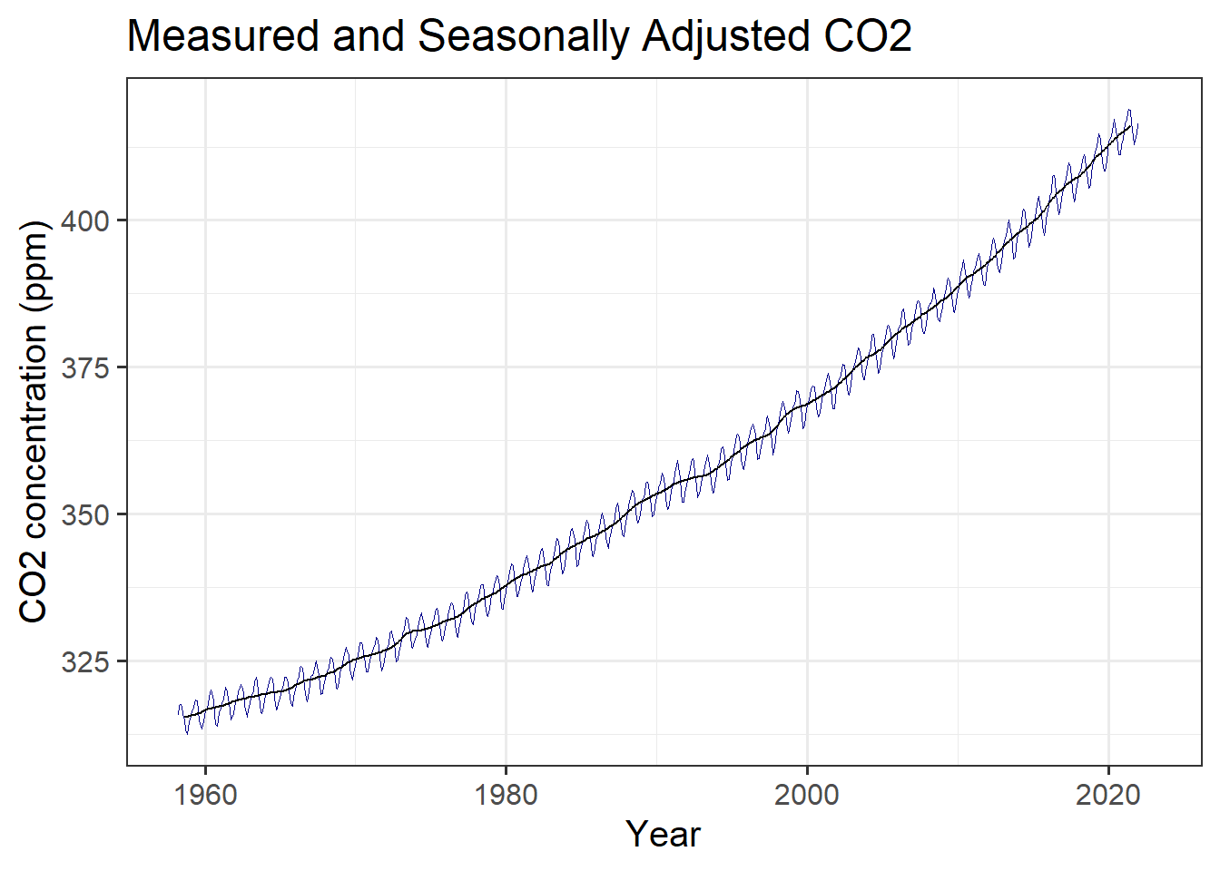
(#fig:plot_mlo_annual)Raw and seasonally adjusted measurements of atmospheric CO2, from Mauna Loa.
But wait: we might want a legend to tell the reader what each colored line represents. We can create new aesthetics for the graph mapping to do this:
mlo_simple %>%
  mutate(annual = slide_vec(co2, mean, .before = 5, .after = 6)) %>%
  ggplot(aes(x = date)) +
  geom_line(aes(y = co2, color = "Raw"), size = 0.1) +
  geom_line(aes(y = annual, color = "12-month average"), size = 0.5) +
  scale_color_manual(values = c("Raw" = "darkblue",
                                "12-month average" = "black"),
                     name = "Smoothing") +
  labs(x = "Year", y = "CO2 concentration (ppm)",
       title = "Measured and Seasonally Adjusted CO2")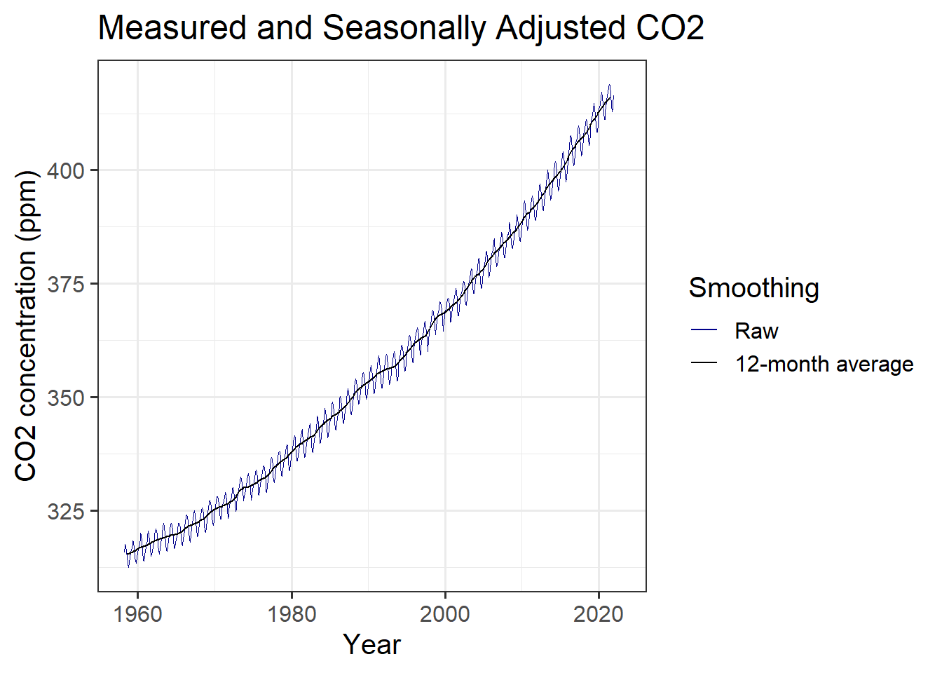
(#fig:plot_mlo_annual_2)Raw and seasonally adjusted measurements of atmospheric CO2, from Mauna Loa, with a legend identifying the different lines.
We can also anlyze this data to estimate the average trend in CO2.
We use the lm function in R to fit a straight line to the data,
and we use the tidy function from the broom package to
print the results of the fit nicely.
R has many powerful functions to analyze data, but here we will just use a very
simple one. We specify the linear relationship to fit using R’s formula
language. If we want to tell R that we think co2 is related to date
by the linear relationship \(co2 = a + b \times \text{date}\), then we write
the formula co2 ~ date. The intercept is implicit, so we don’t have to spell
it out.
co2_fit = lm(co2 ~ date, data = mlo_simple)

library(broom)

tidy(co2_fit)
## # A tibble: 2 x 5
## term estimate std.error statistic p.value
## <chr> <dbl> <dbl> <dbl> <dbl>
## 1 (Intercept) -2819. 18.1 -156. 0
## 2 date 1.60 0.00907 176. 0This shows us that the trend is for CO2 to rise by 1.6 ppm per year, with an uncertainty of plus or minus 0.009.
If we want to assign the value of the trend to a variable, we do it like this:
co2_trend = coef(co2_fit)['date']

print(co2_trend)
## date
## 1.595783We can also plot a linear trend together with the data:
mlo_simple %>%
  ggplot(aes(x = date, y = co2)) +
  geom_line() +
  geom_smooth(method = 'lm') +
  labs(x = "Year", y = "CO2 concentration (ppm)",
       title = "Measured CO2 and Linear Fit")
## `geom_smooth()` using formula 'y ~ x'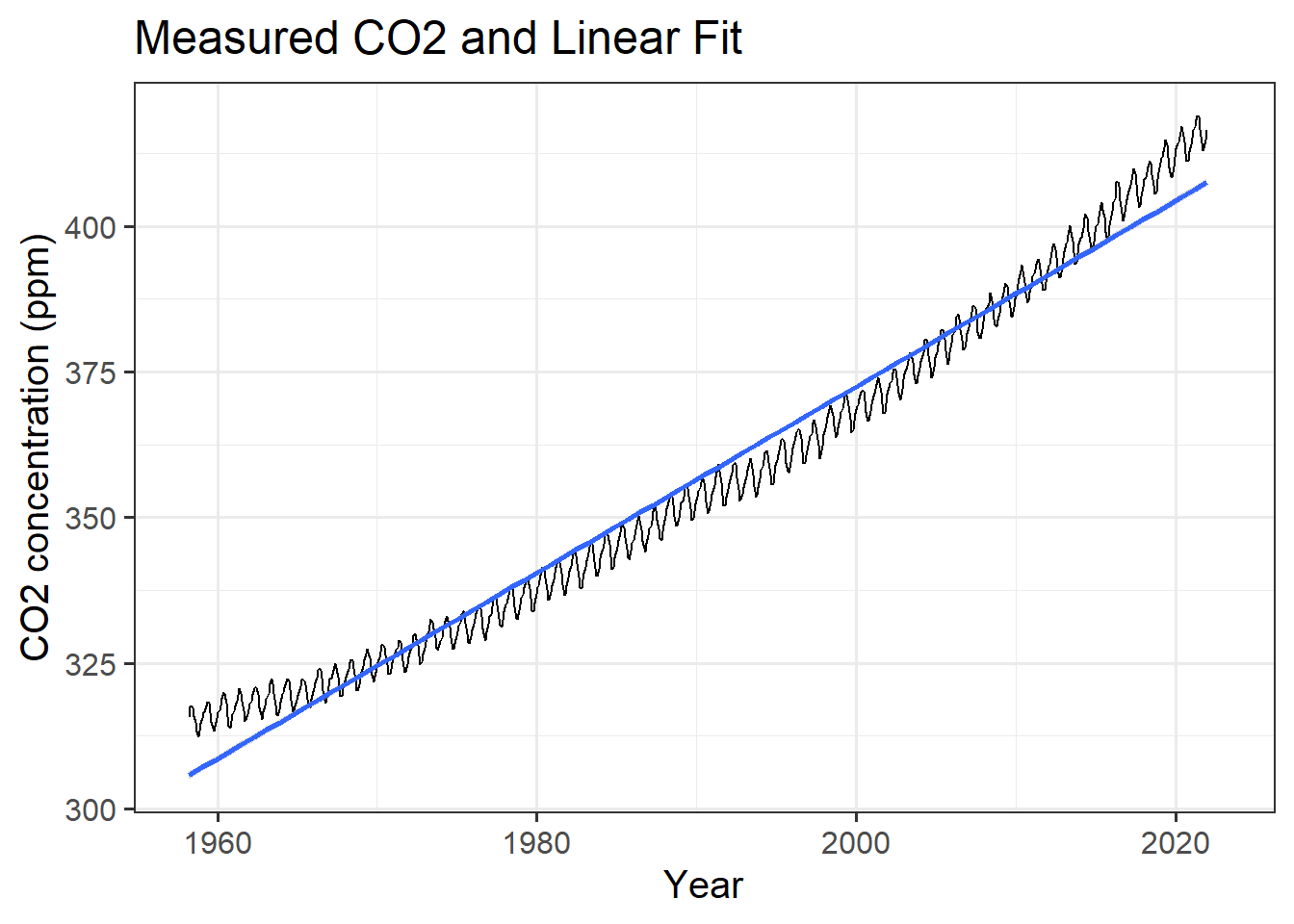
(#fig:plot_mlo_with_fitted_trend)Trend in atmospheric CO2.
Exercises
In the file lab-02-report.Rmd, complete the exercises, filling in the code
and explanatory text and answering the questions in the exercises.
You can copy code from these worked examples and edit it to apply it to the exercises in the lab report file.
Pivoting Data Frames
If you have data in a tibble or data.frame, you can re-organize it to make
it easier to analyze. We use the functions pivot_longer and pivot_wider
for this.
U.S. Presidential approval ratings 1945–1974
Here is an example of using pivot_longer, using a data set of quarterly
approval ratings for U.S. presidents from 1945–2021:
df = read_rds(file.path(data_dir, "presidential_approval.Rds"))

print("First 10 rows of df are")
## [1] "First 10 rows of df are"print(head(df, 10))## # A tibble: 10 x 6
## president year Q1 Q2 Q3 Q4
## <chr> <int> <dbl> <dbl> <dbl> <dbl>
## 1 Harry S. Truman 1945 NA 84 NA 67
## 2 Harry S. Truman 1946 23.3 0.5 -19 -15.5
## 3 Harry S. Truman 1947 29.3 32.3 29.5 21
## 4 Harry S. Truman 1948 21 -8.67 NA NA
## 5 Harry S. Truman 1949 42.5 24.5 14 NA
## 6 Harry S. Truman 1950 -1 -3.5 -0.25 -8
## 7 Harry S. Truman 1951 -27 -34.3 -24.3 -32
## 8 Harry S. Truman 1952 -41 -29.5 -30 -23.8
## 9 Dwight D. Eisenhower 1953 62 63.5 53.8 40.5
## 10 Dwight D. Eisenhower 1954 48.8 40 46.2 38.3For each year, the table has a column for the president, a column for the year, and four columns (Q1 … Q4) that hold the quarterly net-approval ratings for the president in that quarter. Now we want to organize these data into four columns: one column for the president, one column for the year, one column to indicate the quarter, and one column to indicate the net approval rating.
We do this with the pivot_longer function.
the pivot_longer command organizes the data into tidy columns:
names_to = "quarter"tells pivot_longer to create a column called “quarter” and store the names of the original columns there.values_to = "approval"tells pivot_longer to create a column called “approval” and store the values from the columns there.cols = -c(president, year)tells pivot_longer NOT to change the columns “president” and “year”.
So the approval ratings from the second quarter of 1960 will be stored in
a row where the column president contains “Dwight D. Eisenhower”,
year contains 1960, quarter contains “Q2”, and
net_approval contains the net approval rating.
I also use the arrange() command to sorts the rows of the resulting
data frame to put the years in ascending order, from
1945 to 2021,
and within each year, sort the quarters in alphabetical order from Q1 to Q4
df_long = df %>%
  pivot_longer(cols = -c(president, year),
               names_to = "quarter", values_to = "net_approval") %>%
  arrange(year, quarter)

head(df_long) # print the first few rows of the tibble.
## # A tibble: 6 x 4
## president year quarter net_approval
## <chr> <int> <chr> <dbl>
## 1 Harry S. Truman 1945 Q1 NA
## 2 Harry S. Truman 1945 Q2 84
## 3 Harry S. Truman 1945 Q3 NA
## 4 Harry S. Truman 1945 Q4 67
## 5 Harry S. Truman 1946 Q1 23.3
## 6 Harry S. Truman 1946 Q2 0.5We can use the pivot_wider function to do the opposite and pivot our new
data frame back to the original format:
df_wide = df_long %>%
  pivot_wider(names_from = "quarter", values_from = "net_approval") %>%
  arrange(year)

head(df_wide) # print the first few rows of the tibble.
## # A tibble: 6 x 6
## president year Q1 Q2 Q3 Q4
## <chr> <int> <dbl> <dbl> <dbl> <dbl>
## 1 Harry S. Truman 1945 NA 84 NA 67
## 2 Harry S. Truman 1946 23.3 0.5 -19 -15.5
## 3 Harry S. Truman 1947 29.3 32.3 29.5 21
## 4 Harry S. Truman 1948 21 -8.67 NA NA
## 5 Harry S. Truman 1949 42.5 24.5 14 NA
## 6 Harry S. Truman 1950 -1 -3.5 -0.25 -8Grouping and Summarizing
Now suppose we want to find the average approval for each year?
We can use the functions group_by and summarize with df_long.
group_by(df, year) or df %>% group_by(year) group the rows of the data frame
into groups that have the same year (so there is a group for each year,
each of which contains the rows for the four quarters of that year), and then
summarize(net_approval = mean(net_approval)) replaces those four
rows in each group with the average over all four quarters.
After you call summarize you usually want to ungroup your data, because
it’s generally easier to work with ungrouped data unless you have a reason to
group it. You do this with ungroup(df) or df %>% ungroup().
df_annual = df_long %>% group_by(year) %>%
  summarize(net_approval = mean(net_approval, na.rm = TRUE)) %>%
  ungroup()

head(df_annual)
## # A tibble: 6 x 2
## year net_approval
## <int> <dbl>
## 1 1945 75.5
## 2 1946 -2.67
## 3 1947 28.0
## 4 1948 6.17
## 5 1949 27
## 6 1950 -3.19The na.rm = TRUE argument to mean in the code above tells R to ignore
rows where net_approval has a missing (NA, or “not available”) value.
Normally, if there is a missing value in a function like mean or max or
min, or sum, the result is NA because you’re trying to take the average
(or maximum, minumum, sum, etc.) of a bunch of numbers where some are missing,
so you don’t know what the average is.
Functions like these often have an option to call them with na.rm = TRUE,
that calculates the mean, minimum, maximum, sum, or whatever for the values
that are known, and ignore any missing values.
You can also group by multiple variables at once, so if you had weather data
for every day over ten years, you could group by year and month to calculate
the monthly average conditions:
# suppose the variable df_daily has daily temperatures for many years,
# with columns year, month, day, and temperature
#
df_monthly = df_daily %>% group_by(year, month) %>%
  summarize(temperature = mean(temperature, na.rm = TRUE)) %>%
  ungroup()