Lab #2 Lab #2 Answers
PDF version
Lab #2 Answers
Introduction
This exercise uses measurements of carbon dioxide from the laboratory on Mauna Loa, Hawaii, that was started by C. David Keeling in 1958.
Downloading CO2 Data from Mauna Loa Observatory
We start by downloading the data from https://scrippsco2.ucsd.edu/assets/data/atmospheric/stations/in_situ_co2/monthly/monthly_in_situ_co2_mlo.csv. The code here checks to see if the file already exists, so we don’t download it again every time we build this report.
if (!file.exists('_data/mlo_data.csv')) {
  download.file(mlo_url, '_data/mlo_data.csv')
}
After downloading the data, we process it, following the worked example in the instructions:
mlo_data = read_csv('_data/mlo_data.csv',
                    skip = 57,  # skip the first 57 rows
                    col_names = c('year', 'month', 'date.excel', 'date',
                                  'co2_raw', 'co2_raw_seas',
                                  'co2_fit', 'co2_fit_seas',
                                  'co2_filled', 'co2_filled_seas'),
                    col_types = 'iiiddddddd',
                    # ^^^ the first three columns are integers and the  next
                    # 7 are real numbers
                    na = '-99.99'
                    # ^^^ interpret -99.99 as a missing value
) %>% clean_names()
mlo_simple = mlo_data %>% select(year, month, date, co2 = co2_filled)mlo_data_adjusted = mlo_simple %>%
mutate(co2_annual = slide_vec(co2, mean, .before = 5, .after = 6))library(broom)
co2_fit = lm(co2 ~ date, data = mlo_simple)
co2_trend = coef(co2_fit)['date']Exercises for Part 1
Exercises with CO2 Data from the Mauna Loa Observatory
Using the select function, make a new data tibble called mlo_seas, from
the original mlo_data, which only has two columns: date and
co2_seas, where co2_seas is a renamed version of co2_filled_seas from the
original tibble.
mlo_seas = mlo_data %>% select(date, co2_seas = co2_filled_seas)Now plot this with co2_seas on the y axis and date on the x axis,
and a linear fit:
mlo_seas %>% ggplot(aes(x = date, y = co2_seas)) +
  geom_line(size = 1) +
  geom_smooth(method = "lm") +
  labs(x = "Year", y = "CO2 (seasonally adjusted)")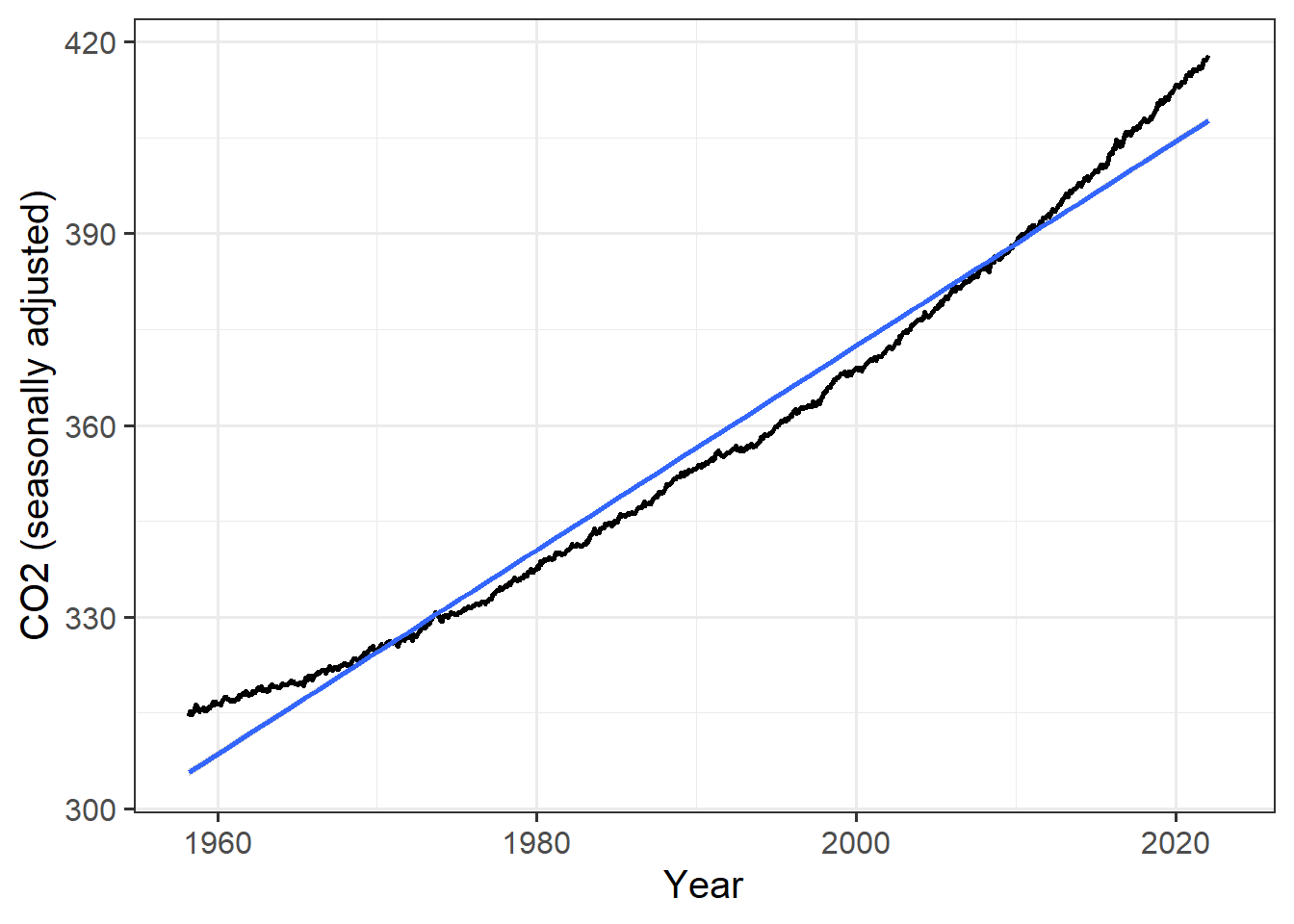
Now fit a linear function to find the annual trend of co2_seas. Save
the results of your fit in a variable called fit_seas, and extract the
trend in CO2 concentration to a variable called trend_seas.
fit_seas = lm(co2_seas ~ date, data = mlo_seas)
trend_seas = coef(fit_seas)['date']
Compare the trend you fit to the seasonally adjusted data to the trend of the
raw co2_filled data, from the workecd exampled.
You can get the trend for the worked example from the variable co2_fit,
which was defined above, in the code chunk calc_mlo_trend.
Answer:
The trend in the seasonally adjusted data (trend_seas) is
1.60 ppm CO2 per year, which is very
close to the trend we fit to the raw data
(co2_trend = 1.60).
Exercises with Global Temperature Data from NASA
We can also download a data set from NASA’s Goddard Institute for Space Studies (GISS), which contains the average global temperature from 1880 through the present.
The URL for the data file is stored in the variable giss_url so you
don’t have to type it in here.
Download this file and save it in the directory
_data/global_temp_land_sea.csv.
You may want to use if (! file.exists(...)), as in the example above of
downloading the CO2 data, to avoid downloading the
file again if it already exists in your _data directory.
if (!file.exists('_data/global_temp_land_sea.csv')) {
  download.file(giss_url, '_data/global_temp_land_sea.csv')
}
Now read the file into R, using the read_csv function, and assign
the resulting tibble to a variable giss_temp
giss_temp = read_csv("_data/global_temp_land_sea.csv", skip = 1,
                     col_names = TRUE, na = '***')
The code below shows the first 5 lines of the resulting tibble, so you can see what it looks like:
head(giss_temp, 5)## # A tibble: 5 x 19
## Year Jan Feb Mar Apr May Jun Jul Aug Sep Oct Nov Dec
## <dbl> <dbl> <dbl> <dbl> <dbl> <dbl> <dbl> <dbl> <dbl> <dbl> <dbl> <dbl> <dbl>
## 1 1880 -0.17 -0.24 -0.08 -0.15 -0.09 -0.2 -0.17 -0.09 -0.14 -0.23 -0.21 -0.17
## 2 1881 -0.19 -0.13 0.04 0.06 0.07 -0.18 0.01 -0.03 -0.15 -0.21 -0.18 -0.06
## 3 1882 0.17 0.14 0.05 -0.15 -0.13 -0.22 -0.16 -0.07 -0.15 -0.23 -0.16 -0.36
## 4 1883 -0.29 -0.36 -0.12 -0.18 -0.17 -0.06 -0.07 -0.13 -0.22 -0.11 -0.24 -0.11
## 5 1884 -0.13 -0.08 -0.36 -0.4 -0.33 -0.34 -0.32 -0.27 -0.27 -0.25 -0.33 -0.3
## # ... with 6 more variables: `J-D` <dbl>, `D-N` <dbl>, DJF <dbl>, MAM <dbl>,
## # JJA <dbl>, SON <dbl>Let’s focus on the months only. Use select to select just the columns for
“Year” and January through December (if you are selecting a consecutive range
of columns between “Foo” and “Bar” in the tibble df, you can call
select(df, Foo:Bar) or df %>% select(Foo:Bar)).
Save the result in a variable called giss_monthly
giss_monthly = giss_temp %>% select(Year:Dec)Use pivot_longer to organize the data to have three columns:
one for the year, one for the name of the month, and one for the
temperature anomaly in that month.
Store the result in a new variable called giss_g
  giss_g = pivot_longer(giss_monthly, cols = -Year, names_to = "month",
                        values_to = "anomaly")
The following command will convert the month column in giss_g into an
ordered factor that uses the integer values 1, 2, …, 12 to stand for
“Jan”, “Feb”, …, “Dec”, and then uses those integer values to create a new
column, date that holds the fractional year, just as the date column in
mlo_data did:
giss_g = giss_g %>%
  mutate(month = factor(month, levels = month.abb, ordered = TRUE),
         date = Year + (as.integer(month) - 0.5) / 12) %>%
  arrange(date)`
Then we create a new column called date to get the fractional year
corresponding to that month. We have to explicitly convert the ordered factor
into a number using the function as.integer(), and we subtract 0.5 because
the time that corresponds to the average temperature for the month is the
middle of the month.
Below, use code similar to what I put above to add a new date column to
giss_g.
giss_g = giss_g %>%
  mutate(month = factor(month, levels = month.abb, ordered = TRUE),
         date = Year + (as.integer(month) - 0.5) / 12) %>%
  arrange(date)
Now plot the monthly temperature anomalies versus date:
ggplot(giss_g, aes(x = date, y = anomaly) ) +
  geom_line(size = 1) +
  labs(x = "Year", y = "Temperature anomaly (C)")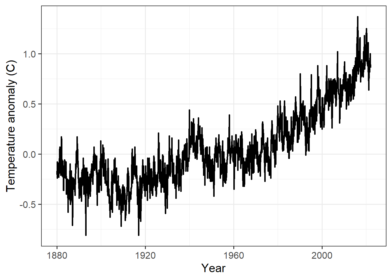
Make a new plot in which you plot a thin blue line for the monthly anomaly
(use geom_line(aes(y = anomaly), color = "blue", alpha = 0.3, size = 0.1);
alpha is an optional specification for transparency where 0 means invisible
(completely transparent) and 1 means opaque),
a medium dark green line for the one-year sliding average,
and a thick dark blue line for the ten-year sliding average.
giss_g %>%
  mutate(smooth_1 = slide_vec(anomaly, mean, .before = 5, .after = 6),
         smooth_10 = slide_vec(anomaly, mean, .before = 59, .after = 60)) %>%
  ggplot(aes(x = date)) +
  geom_line(aes(y = anomaly), alpha = 0.3, size = 0.1, color = "blue") +
  geom_line(aes(y = smooth_1), alpha = 0.6, size = 0.6, color = 'darkgreen') +
  geom_line(aes(y = smooth_10), alpha = 1, size = 1, color = "darkblue") +
  labs(x = "Year", y = "Temperature anomaly (C)")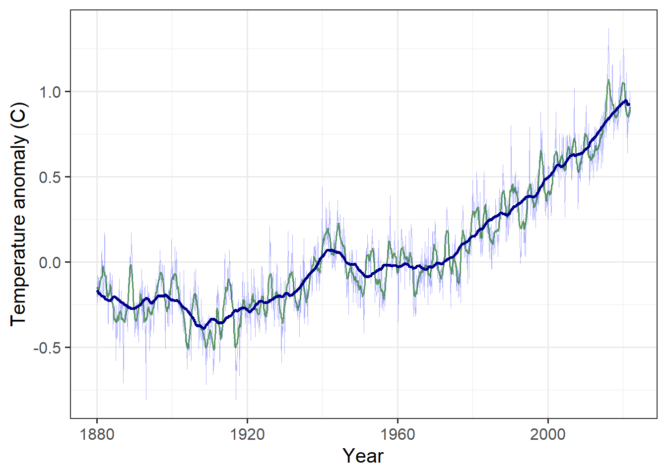
The graph shows that temperature didn’t show a steady trend until starting around 1970, so we want to isolate the data starting in 1970 and fit a linear trend to it.
Below, create a new variable giss_recent and assign it a subset of giss_g
that has all the data from January 1970 through the present. Fit a linear trend
to the monthly anomaly and report it.
What is the average change in temperature from one year to the next?
giss_recent = giss_g %>% filter(Year >= 1970)
temp_fit = lm(anomaly ~ date, data = giss_recent)
temp_trend = coef(temp_fit)["date"]
Answer: On average, the temperature rose by 0.019 degree Celsius per year.
Did Global Warming Stop after 1998?
It is a common skeptic talking point that global warming stopped in 1998. In years with strong El Niños, global temperatures tend to be higher and in years with strong La Niñas, global temperatures tend to be lower. We will discuss why later in the semester.
The year 1998 had a particularly strong El Niño, and the year set a record for global temperature that was not exceeded for several years. Indeed, compared to 1998, it might look as though global warming paused for many years.
We will examine whether this apparent pause has scientific validity.
To begin with, we will take the monthly GISS temperature data and convert it to annual average temperatures, so we can deal with discrete years, rather than separate temperatures for each month.
We do this with the group_by and summarize functions (see the
examples and explanation in the worked examples document).
We also want to select only recent data, so we arbitrarily say we will look at temperatures starting in 1979, which gives us 19 years before the 1998 El Ni˜o.
If we go back to the original giss_g data tibble, run the following code:
giss_annual = giss_g %>%
  filter(Year >= 1979) %>%
  group_by(Year) %>%
  summarize(anomaly = mean(anomaly)) %>%
  ungroup() %>%
  mutate(date = Year + 0.5, before = Year < 1998)
Now plot the data and color the points for 1998 and afterward dark red to help us compare before and after 1998.
ggplot(giss_annual, aes(x = date, y = anomaly)) +
  geom_line(size = 1) +
  geom_point(aes(color = before), size = 3) +
  scale_color_manual(values = c("TRUE" = "darkblue", "FALSE" = "darkred"),
                     guide = "none") +
  # ^^^ color "before" points dark blue, "after" points dark red.
  # guide = "none" tells ggplot not to show a legend explaining the colors.
  labs(x = "Year", y = "Temperature Anomaly")
Does it look as though the red points are not rising as fast as the blue points?
Let’s just plot the data from the years 1998–2011. Use the filter function
to select just the date from the years 1998–2011 and pass that to ggplot.
  giss_annual %>% filter(Year >= 1998, Year <= 2011) %>%
  ggplot(aes(x = date, y = anomaly)) +
  geom_line(size = 1) +
  geom_point(aes(color = before), size = 3) +
  scale_color_manual(values = c("TRUE" = "darkblue", "FALSE" = "darkred"),
                     guide = "none") +
  # ^^^ color "before" points dark blue, "after" points dark red.
  # guide = "none" tells ggplot not to show a legend explaining the colors.
  labs(x = "Year", y = "Temperature Anomaly")
Now how does it look?
Let’s use the filter function to break the data into two different data sets,
which we will store in tibbles called giss_before and giss_after:
giss_before will have the data from 1979–1998 and the other,
giss_after will have the data from 1998 onward
(note that the year 1998 appears in both data sets).
Also, use the mutate function to add a column called timing to each of the
split data sets and set the value of this column to “Before” for giss_before
and “After” for giss_after.
giss_before = giss_annual %>% filter(Year <= 1998) %>%
  mutate(timing = "Before")
giss_after = giss_annual %>% filter(Year >= 1998) %>%
  mutate(timing = "After")
Now use lm to find the trend in temperature data in giss_before
(from 1979–1998) and assign it to a variable giss_trend.
fit_before = lm(anomaly ~ Year, data = giss_before)
fit_after = lm(anomaly ~ Year, data = giss_after)
trend_before = coef(fit_before)['Year']
trend_after = coef(fit_after)['Year']
Next, combine the two data frames (or tibbles) into one,
using the bind_rows function.
If you have created the data frames giss_before and giss_after, then you
can un-comment the code below to combine them.
giss_combined = bind_rows(giss_before, giss_after)Now let’s use ggplot to plot giss_combined:
- Aesthetic mapping:
- Use the
datecolumn for the x variable. - Use the
anomalycolumn for the y variable. - Use the
timingcolumn to set the color of plot elements
- Use the
- Plot both lines and points.
- Set the
sizeof the lines to 1 - Set the
sizeof the points to 2
- Set the
- Use the
scale_color_manualfunction to set the color of “Before” to “darkblue” and “After” to “darkred” - Use
geom_smooth(data = giss_before, method="lm", color = "blue", fill = "blue", alpha = 0.2, fullrange = TRUE)to show a linear trend that is fit just to thegiss_beforedata.
ggplot(giss_combined, aes(x = date, y = anomaly, color = timing)) +
  geom_line(size = 1) +
  geom_point(size = 2) +
  geom_smooth(data = giss_before, method = "lm", color = "blue",
              fill = "blue", alpha = 0.2, fullrange = TRUE) +
  scale_color_manual(values = c(Before = "darkblue", After = "darkred")) +
  labs(x = "Year", y = "Temperature anomaly")
If the temperature trend changed after 1998 (e.g., if the warming paused, or if it reversed and started cooling) then we would expect the temperature measurements after 1998 to fall predominantly below the extrapolated trend line, and our confidence that the trend had changed would depend on the number of points that fall below the shaded uncertainty range.
How many of the red points fall below the trend line?
Answer: Out of 24 red points (the years 1998–2021), four fall below the trend line
How many of the red points fall above the trend line?
Answer: 20 of the 24 red points fall above the trend line.
If we just look at the years 1998–2012, how many of the red points fall above vs. below the trend line?
Answer: In the 15 years from 1998–2012, 4 points fall below the trend line and 11 fall above it.
What do you conclude about whether global warming paused or stopped for several years after 1998?
Answer: Even if we just look at the years 1998–2012, it is clear that most years were warmer than we would have expected if the warming had followed its historical trend from 1979–1998. This means that if anything, the earth was warming faster than before—the opposite of pausing or stopping. After 2012, all of the points are above the trend line. Most of them are far above it. So there is no reasonable way to look at this data and conclude that it stopped warming, or even paused temporarily, after 1998.
Exercises for Part 2
- All students do Chapter 3, exercises 2–3.
- Graduate students should also do Chapter 3, exercise 1.
For the exercises, use the following numbers:
- Isolar = 1350 W/m2
- \(\sigma = 5.67 \times 10^{-8}\)
- \(\alpha = 0.30\)
- \(\varepsilon = 1.0\)
I_solar = 1350
sigma = 5.67E-8
alpha = 0.30
epsilon = 1.0
Exercise 3.1 (Grad. students only)
The moon with no heat transport. The Layer Model assumes that the temperature of the body in space is all the same. This is not really very accurate, as you know that it is colder at the poles than it is at the equator. For a bare rock with no atmosphere or ocean, like the moon, the situation is even worse because fluids like air and water are how heat is carried around on the planet. So let us make the other extreme assumption, that there is no heat transport on a bare rock like the moon. Assume for comparability that the albedo of this world is 0.30, same as Earth’s.
What is the equilibrium temperature of the surface of the moon, on the equator, at local noon, when the sun is directly overhead? (Hint: First figure out the intensity of the local solar radiation Isolar)
At the equator of the moon at noon, the intensity is just \((1 - \alpha_{\text{moon}} I_{\text{solar}}\). The factor of \(1/4\) that we use for the earth’s average temperature is to account for the fact that we’re averaging the intensity over the whole planet, including the polar regions and the night-time side. But for the equator at noon, we are only looking at the place where the sun is directly overhead, so we don’t need a geometrical factor.
albedo_moon = 0.3
epsilon_moon = 1
I_moon = I_solar * (1 - albedo_moon)
T_moon = (I_moon / (epsilon_moon * sigma))^0.25
Answer: The temperature of the equator of the moon at noon is 359.3 K.
What is the equilibrium temperature on the dark side of the moon?
Answer: The intensity of sunlight on the dark side of the moon is zero, so the temperature would be zero Kelvin.
Exercise 3.2
A Two-Layer Model. Insert another atmospheric layer into the model, just like the first one. The layer is transparent to visible light but a blackbody for infrared.
make_layer_diagram(2)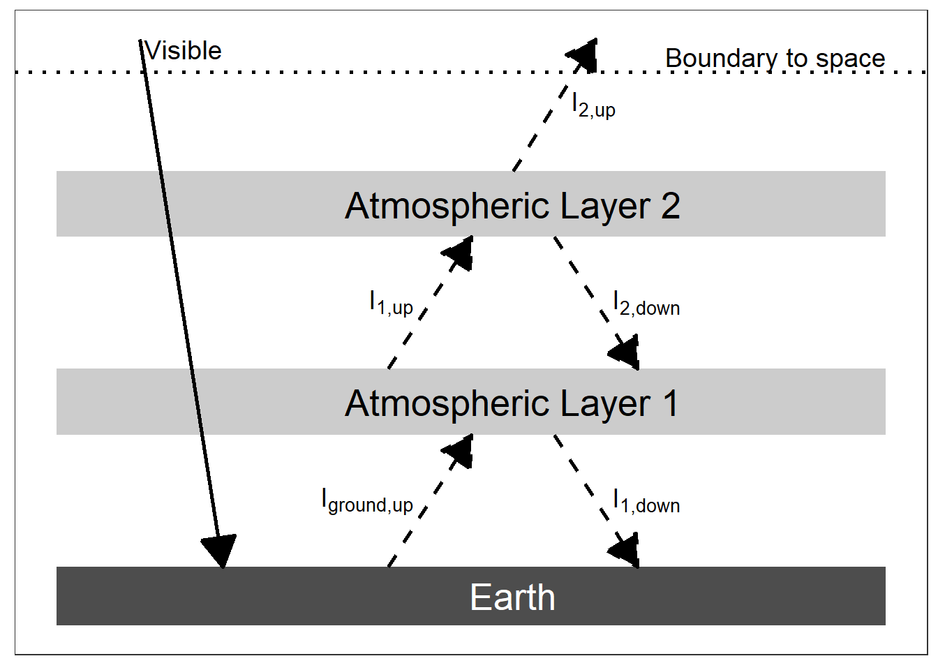
(#fig:two_layer_figure)An energy diagram for a planet with two panes of glass for an atmosphere. The intensity of absorbed visible light is \((1 - \alpha) I_{solar} / 4\).
- Write the energy budgets for both atmospheric layers, for the ground, and for the Earth as a whole, like we did for the One-Layer Model.
Answer:
At each layer, calculate the heat in (in the diagram, this is the sum of all the intensities with arrows that end at the atmospheric layer) and the heat out (the sum of all the intensities that start at the atmospheric layer and have arrows pointing away from it).
- Top of the atmosphere: \(I_{2,\text{up}} = I_{\text{visible}} = (1 - \alpha) I_{\text{solar}} / 4\)
- Layer 2: \(I_{1,\text{up}} = I_{2,\text{up}} + I_{2,\text{down}}\)
- Layer 1: \(I_{\text{ground,up}} + I_{2,\text{down}} = I_{1,\text{up}} + I_{1,\text{down}}\)
- Ground: \(I_{\text{ground,up}} = I_{\text{visible}} + I_{1,\text{down}}\)
- Manipulate the budget for the Earth as a whole to obtain the temperature T2 of the top atmospheric layer, labeled Atmospheric Layer 2 in the figure above. Does this part of the exercise seem familiar in any way? Does the term ring any bells?
Top of the atmosphere:
\[\begin{align*} I_{2,\text{up}} &= I_{\text{visible}} = (1 - \alpha) I_{\text{solar}} / 4\\ I_{2,\text{up}} &= \varepsilon \sigma T_2^4\\ T_2 &= \sqrt[4]{\frac{(I_{2,\text{up}}}{\varepsilon \sigma}} \\ &= \sqrt[4]{\frac{(1 - \alpha) I_{\text{solar}}}{4 \varepsilon \sigma}} \end{align*}\]
This is the same as the bare-rock temperature.
I_visible = (1 - alpha) * I_solar / 4
I_2_up = I_visible
T_2 = (I_2_up / (epsilon * sigma))^0.25
Answer: The temperature of layer 2 is 254.1 K, which is the same as the bare-rock temperature. In layer models, the top layer of the atmosphere is always the bare-rock temperature.
- Insert the value you found for T2 into the energy budget for layer 2, and solve for the temperature of layer 1 in terms of layer 2. How much bigger is T1 than T2?
From the energy budget for Layer 2, I1,up = I2,up + I2,down. The temperature of the bottom of the layer is the same as the temperature for the top of the layer, so I2,down = I2,up
I_1_up = 2 * I_2_up
T_1 = (I_1_up / (epsilon * sigma))^0.25
You could also let R do more of the work for you by writing
I_2_down = I_2_up
I_1_up = I_2_up + I_2_down
T_1 = (I_1_up / (epsilon * sigma))^0.25
Answer: The temperature of layer 1 is 302.1 K. This is the same as the ground temperature in a 1-layer model.
- Now insert the value you found for T1 into the budget for atmospheric layer 1 to obtain the temperature of the ground, Tground. Is the greenhouse effect stronger or weaker because of the second layer?
From the energy budget for layer 1,
- Iground,up + I2,down = I1,up + I1,down
- Iground,up = I1,up + I1,down - I2,down
- I1,down = I1,up and I2,down = I2,up
- so Iground,up = 2 * I1,up - I2,up
I_ground_up = 2 * I_1_up - I_2_up
T_ground = (I_ground_up / (epsilon * sigma))^0.25
Again, you could let R do more of the work for you by writing
I_1_down = I_1_up
I_ground_up = I_1_down + I_1_up - I_2_down
T_ground = (I_ground_up / (epsilon * sigma))^0.25
Answer: Tground = 334.4 K.
We can also use algebra to observe that
\[\begin{align*} I_{\text{ground,up}} &= 2 * I_{1,\text{up}} - I_{2,\text{up}} \\ I_{2,\text{up}} &= 2 I_{2,\text{up}} \\ \intertext{so} I_{\text{ground,up}} &= 4 I_{2,\text{up}} - I_{2,\text{up}} \\ &= 3 I_{2,\text{up}} \\ T_{\text{ground}} &= \sqrt[4]{\frac{3 I_{2,\text{up}}}{\varepsilon \sigma}} \\ &= \sqrt[4]{3} T_{\text{bare rock}}. \end{align*}\]
In a 1-layer model, the ground temperature was 20.25 times the bare-rock temperature, and in a 2-layer model, the bround temperature is 30.25 times the bare-rock temperature.
Exercise 3.3
make_nuclear_winter_diagram()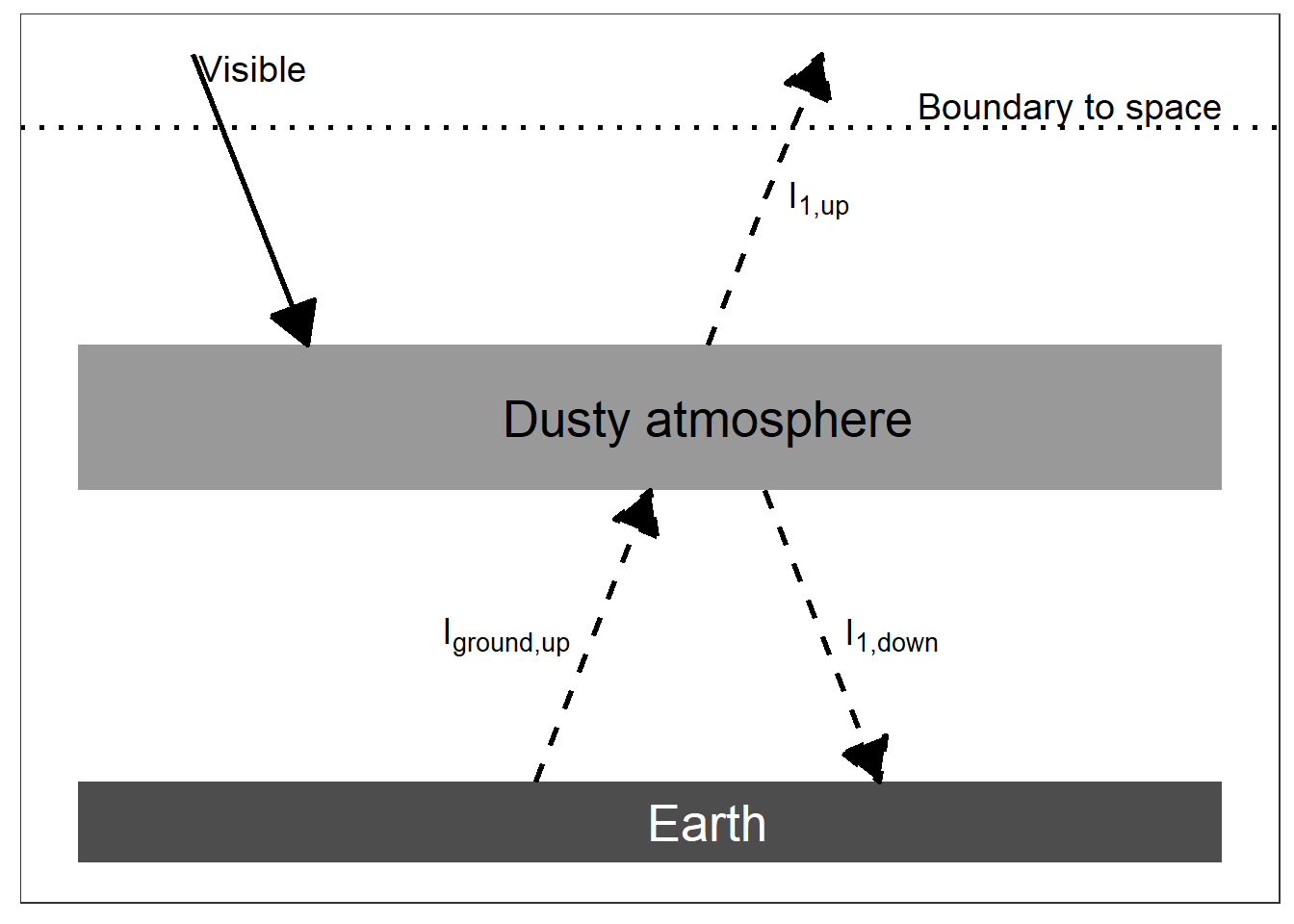
(#fig:nuclear_winter_diagram)An energy diagram for a planet with an opaque pane of glass for an atmosphere. The intensity of absorbed visible light is \((1 - \alpha) I_{solar} / 4\).
Nuclear Winter. Let us go back to the One-Layer Model but change it so that the atmospheric layer absorbs visible light rather than allowing it to pass through (See the figure above). This could happen if the upper atmosphere were filled with dust. For simplicity, assume that the albedo of the Earth remains the same, even though in the real world it might change with a dusty atmosphere.> What is the temperature of the ground in this case?
Answer: Here, the key difference is that the heat from the sun is absorbed by the atmosphere instead of passing through the atmosphere to the ground.
The equation for the atmosphere is the same as in the 1-layer model because we use the energy balance at the boundary to space: \(I_{\text{atm, up}} = I_{\text{visible}} = (1 - \alpha) I_{\text{solar}} / 4\) and the temperature of the atmosphere is the bare-rock temperature, just as the top layer of the atmosphere is for every layer model.
However, things are different at the ground. The energy balance at the dusty atmosphere is
- Ivisible + Iground,up = Iatm,up + Iatm,down
- Iground,up = Iatm,up + Iatm,down - Ivisible
- But Iatm,up = Iatm,down = Ivisible
- So Iground,up = Iatm,up.
- This means that Tground = Tatmosphere = Tbare-rock.
I_visible = (1 - alpha) * I_solar / 4
I_atm_up = I_visible
I_atm_down = I_visible
I_ground_up = I_atm_up + I_atm_down - I_visible
T_ground = (I_ground_up / (epsilon * sigma))^0.25
T_ground = 254.1 K. This is the same as the bare-rock temperature.
The effect of the dust in the atmosphere is to cancel out the greenhouse effect and cool off the surface to the bare-rock temperature. The greenhouse effect works because the atmosphere is transparent to shortwave light and opaque to longwave light. If the atmosphere becomes opaque to shortwave light, then the greenhouse effect doesn’t work.
